Art 2552 (LSU)
ART 2552 examines color as a functional design element of perception and visual communication. In this course we study the history of color classification as well as the natural and cultural significance of color. Students learn common terminology used to categorize and describe color, and how to work with color using both pigment-based and digital methods. Students gain experience in choosing colors and palettes to effectively communicate a message.
Studies
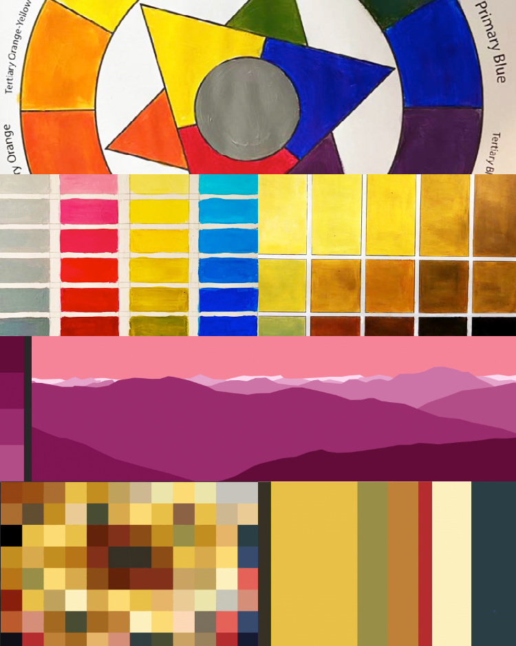
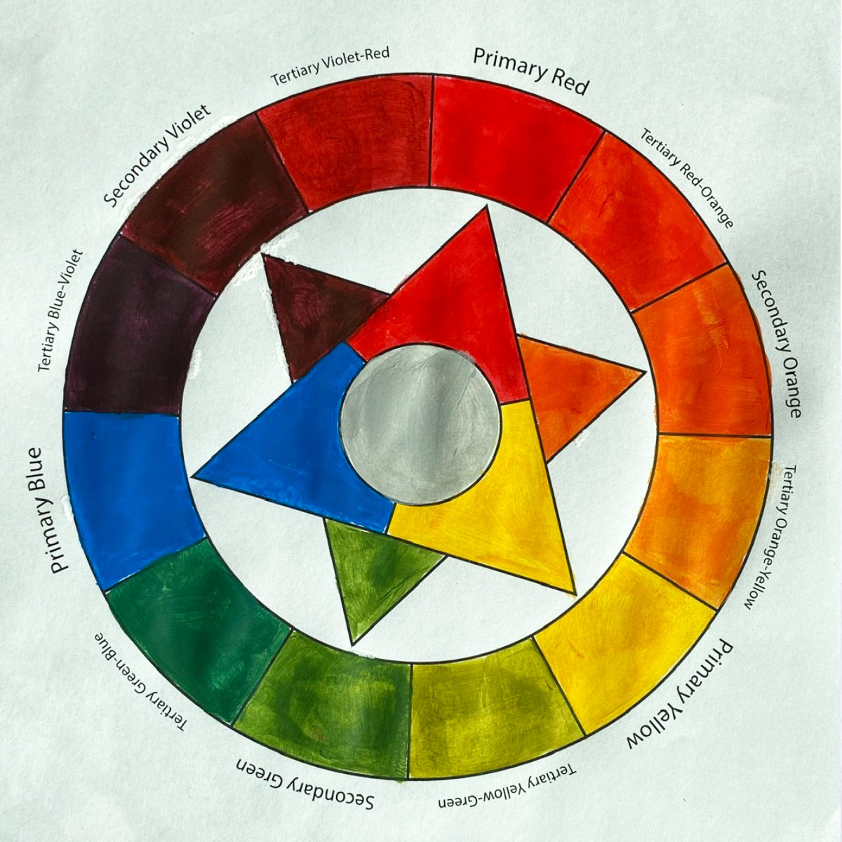
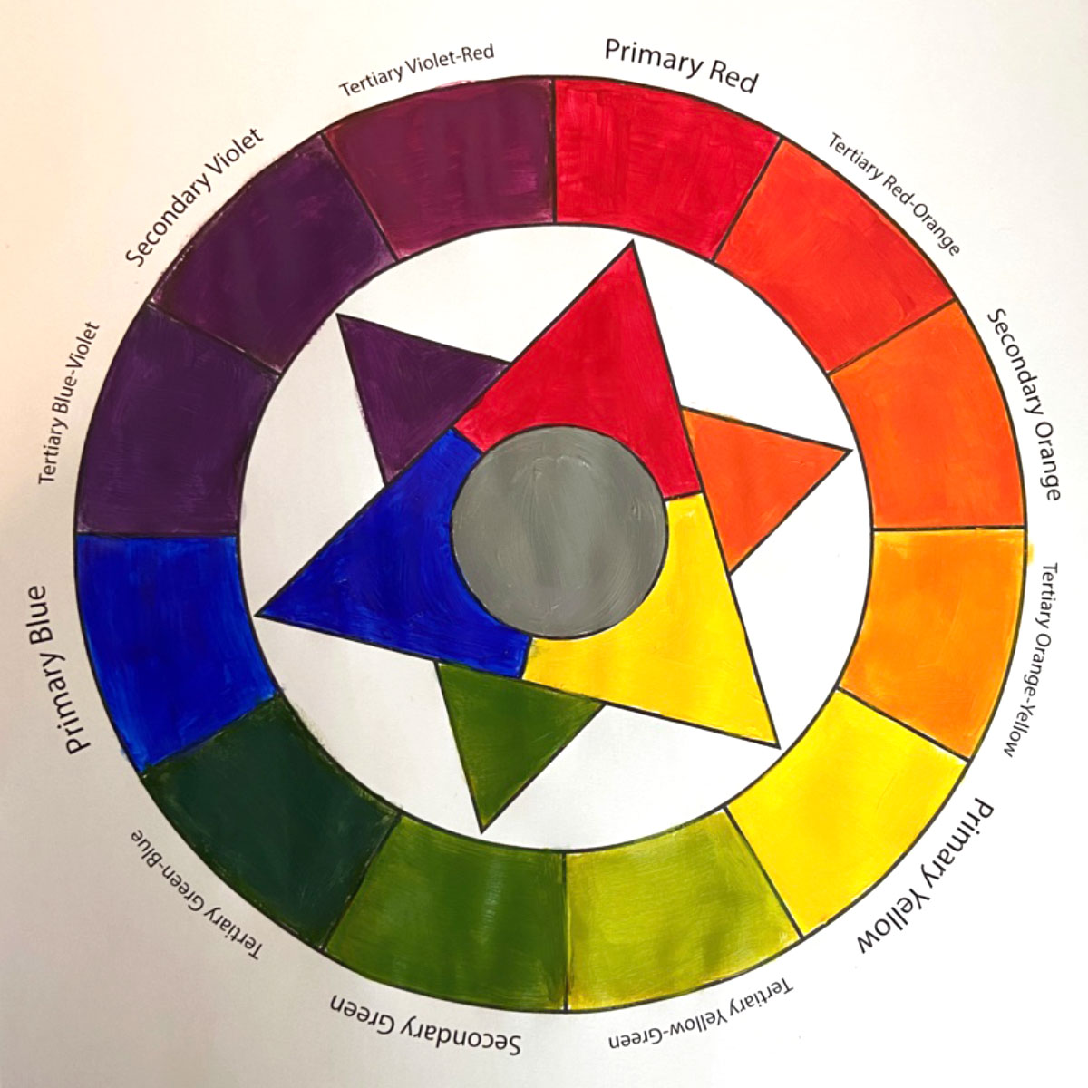
Painted Color Wheel
A traditional RYB color wheel made with acrylic paints to reacquaint students with the basics of color relationships.
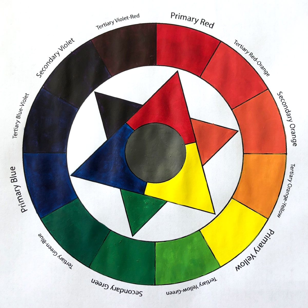
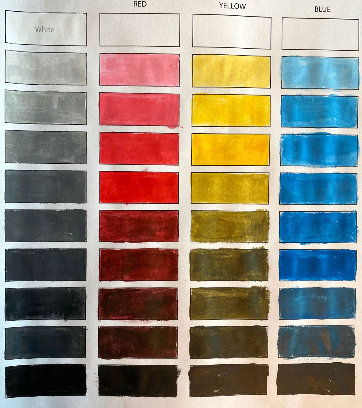
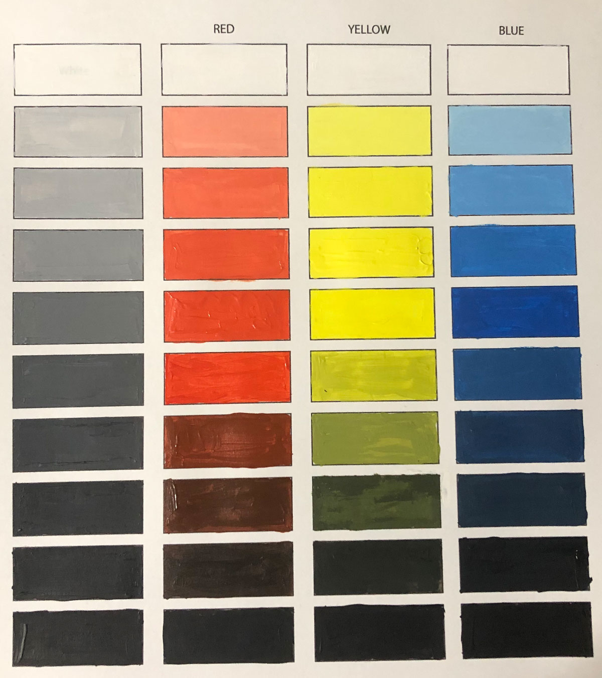
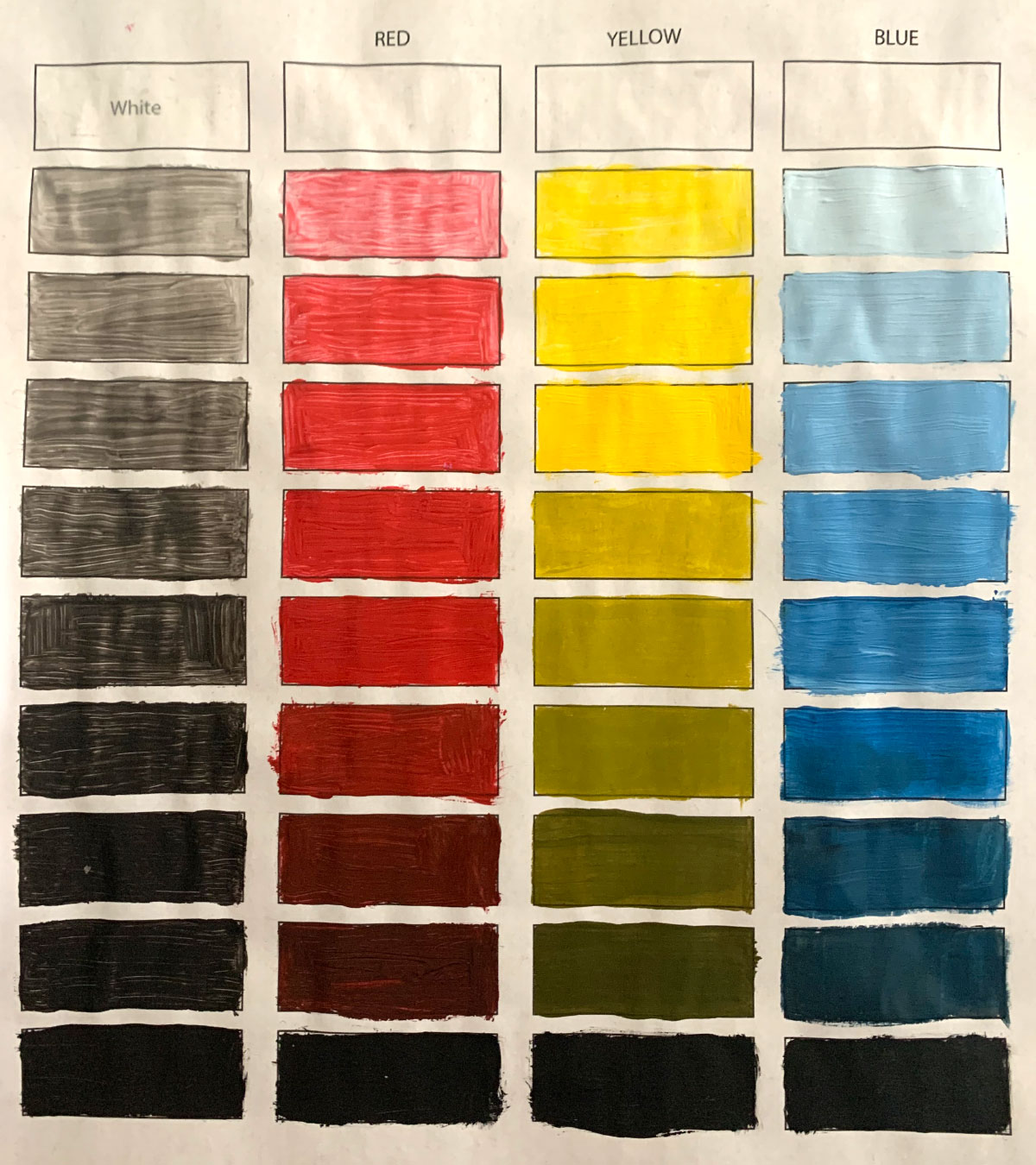
Painted Value Study
A traditional RYB + gray value study made with acrylic paints to help students recognize the inherent value of colors and practice mixing tints and shades.
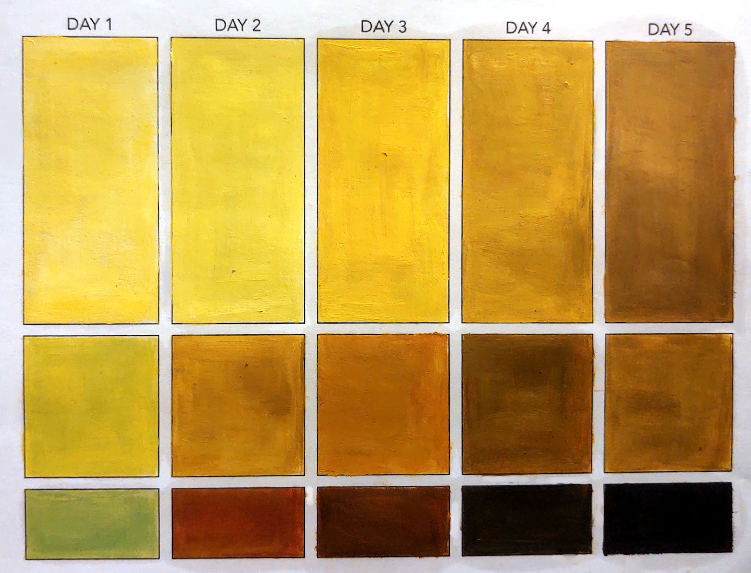
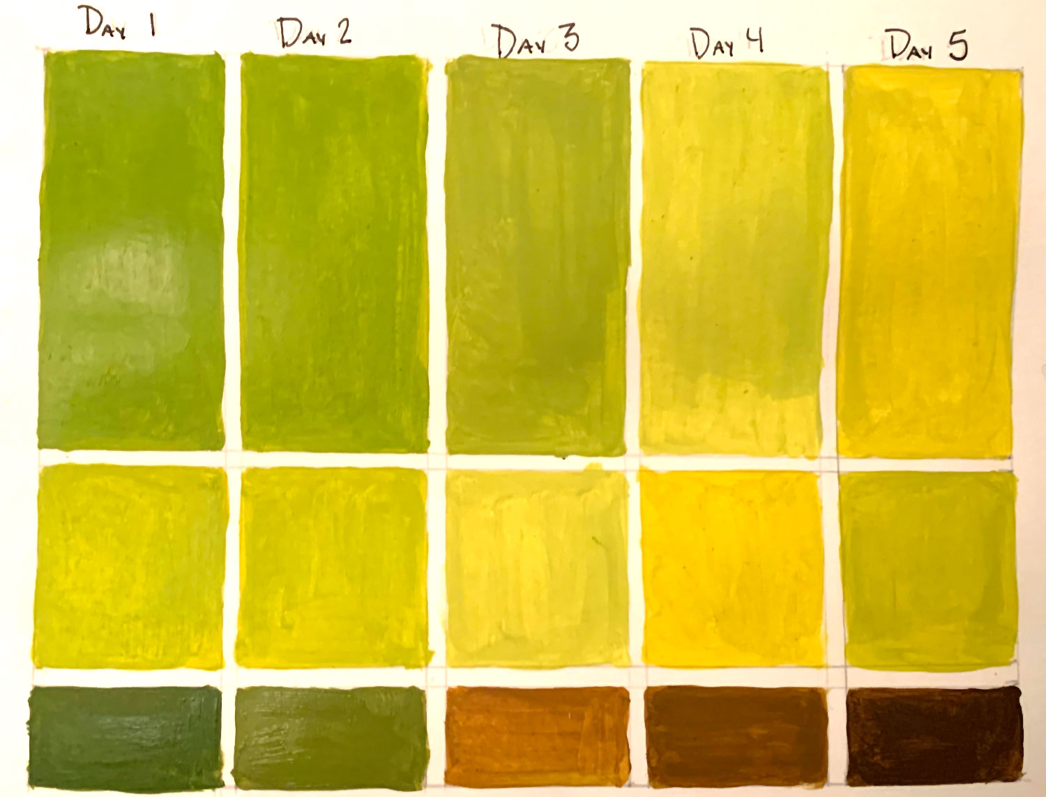
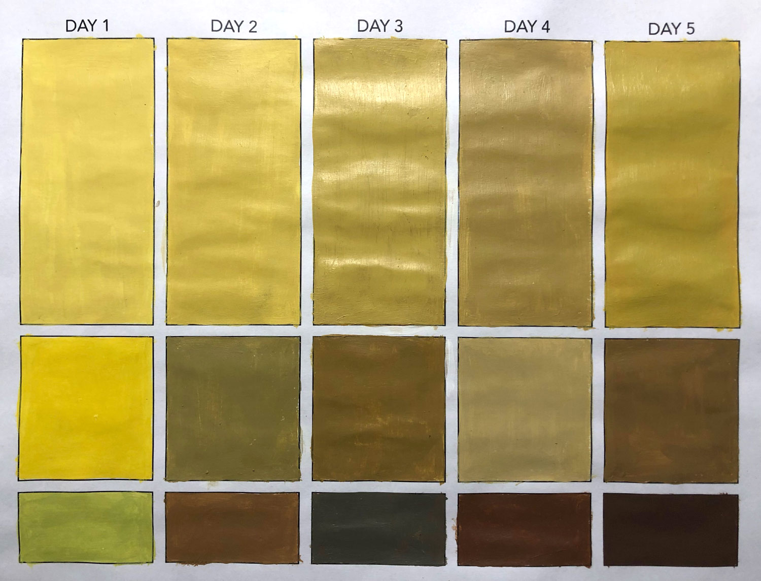
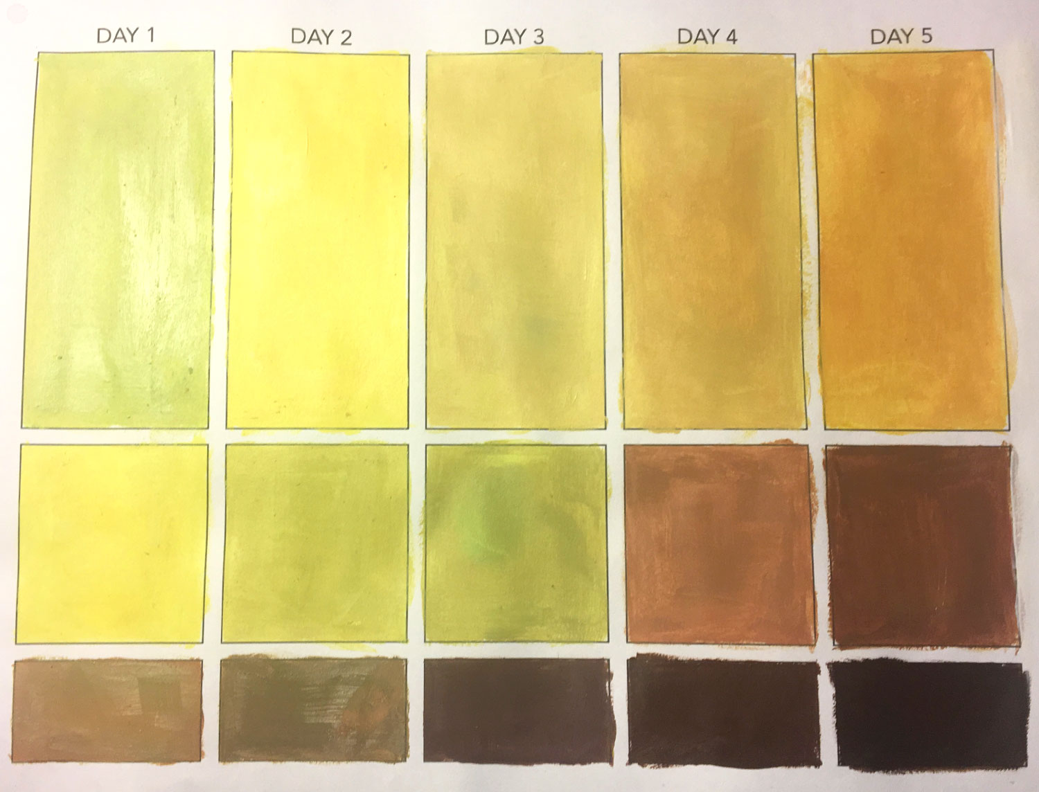
Painted Hue Study
Students photograph a banana over a 5-day period, looking for subtle shifts in hue. Each day they capture a 3-color palette based on the banana’s dominant and accent colors.
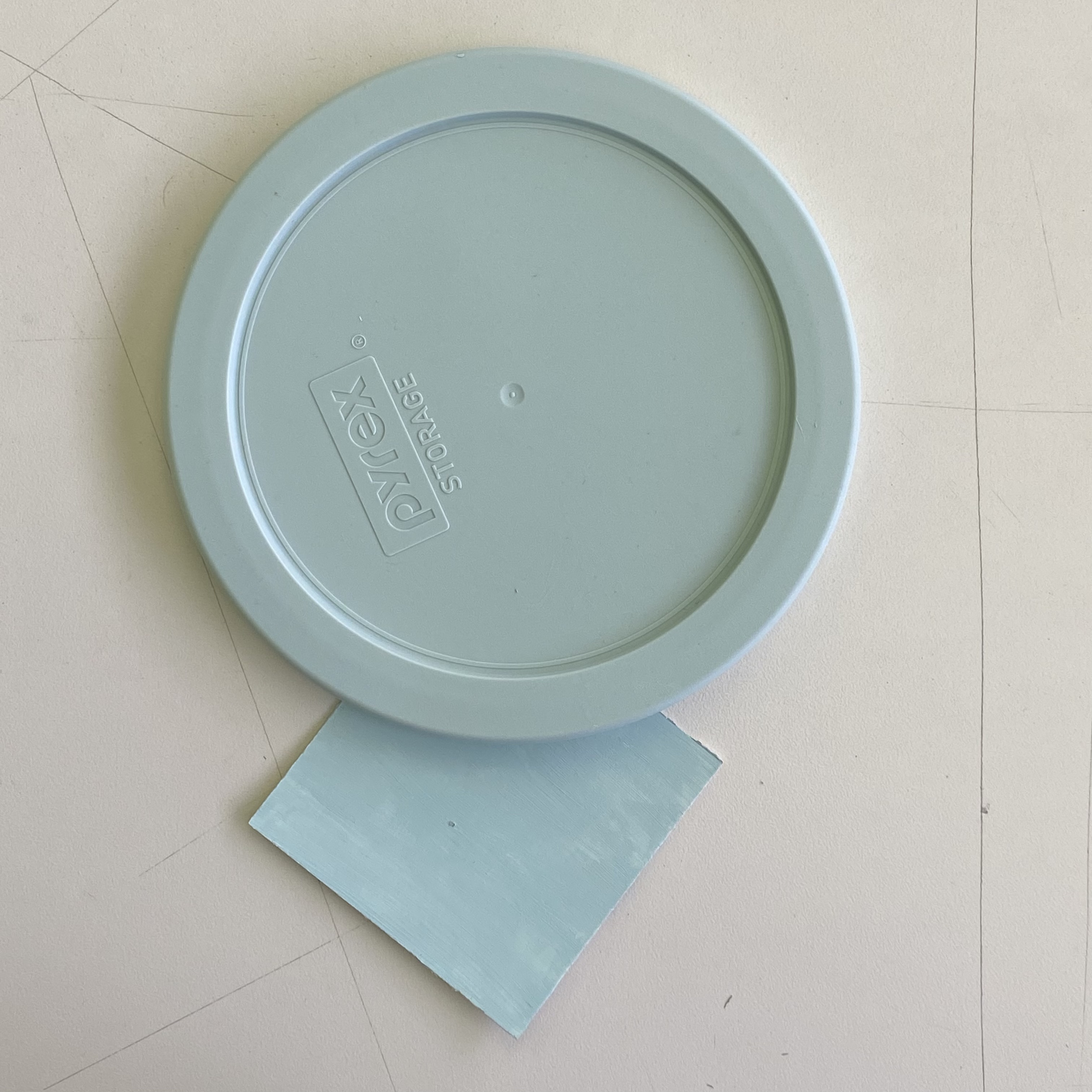
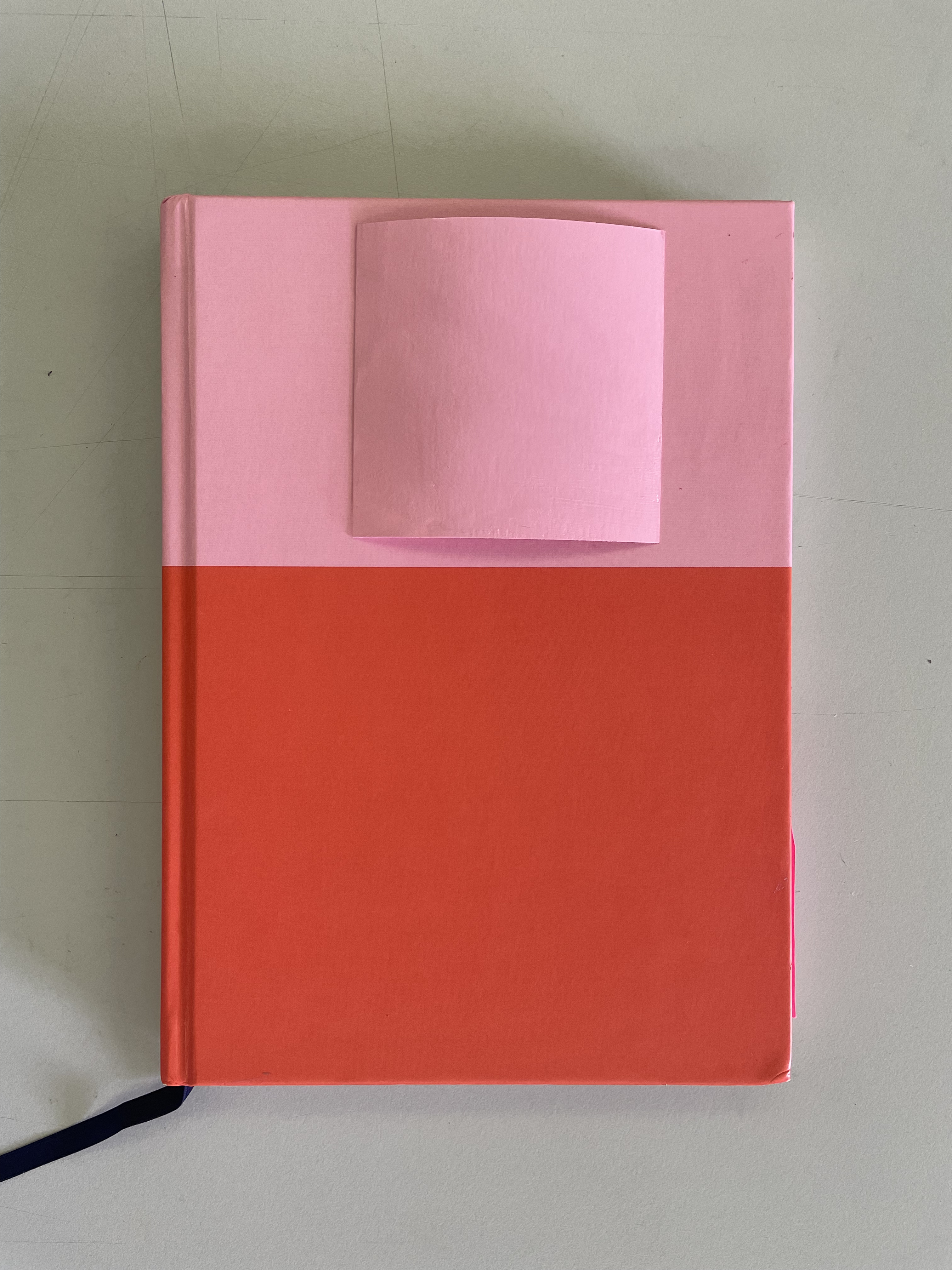
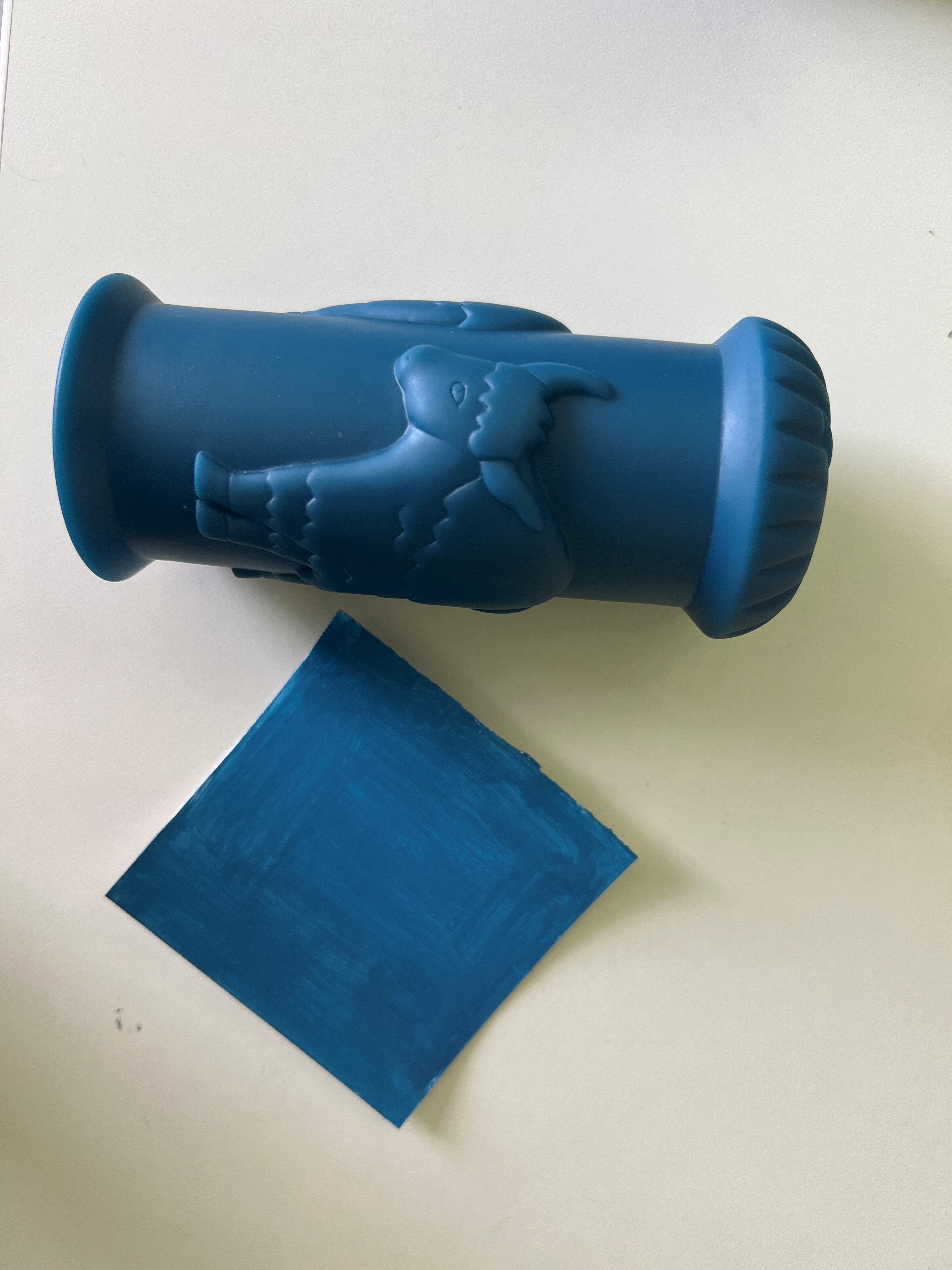
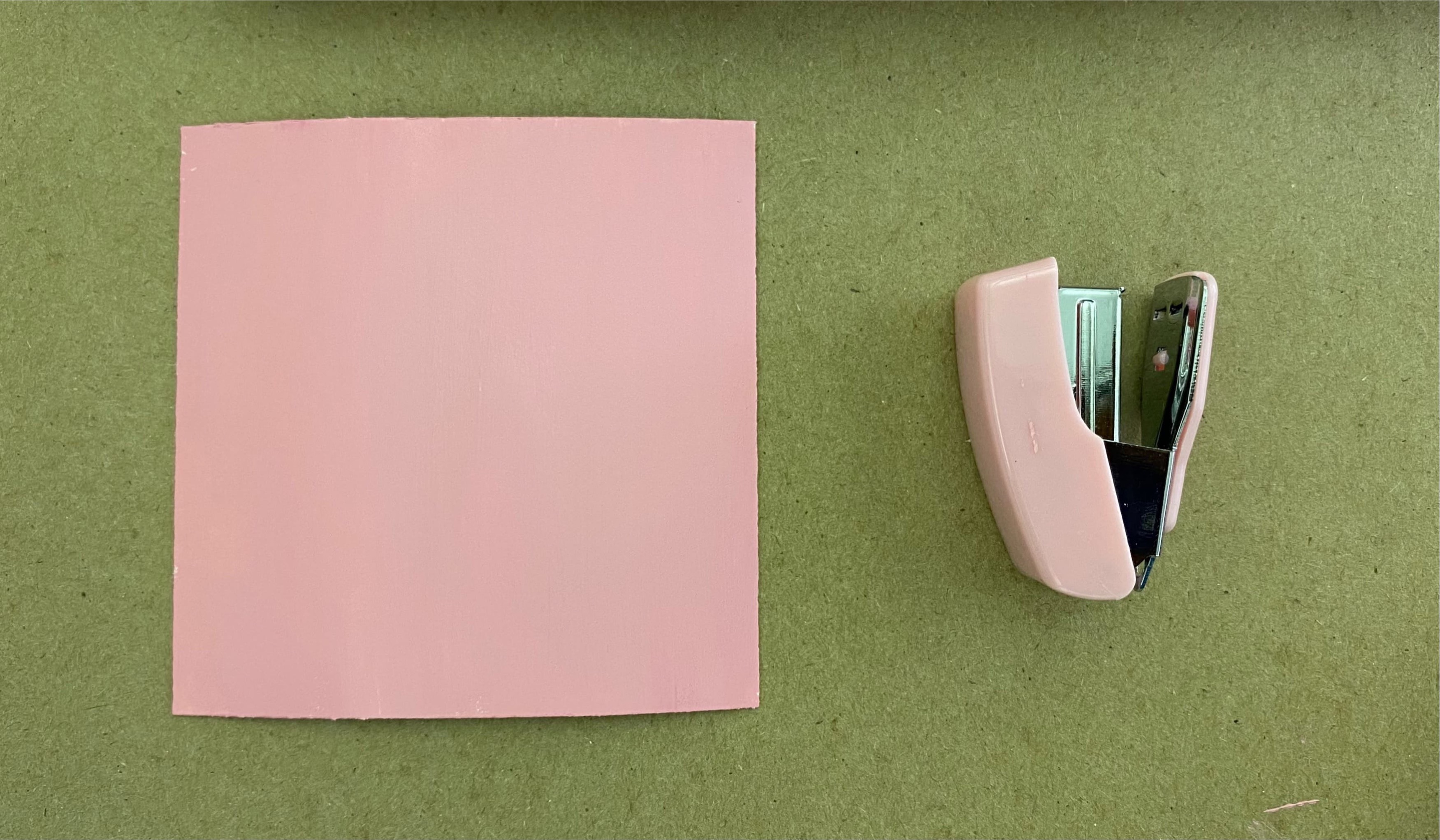
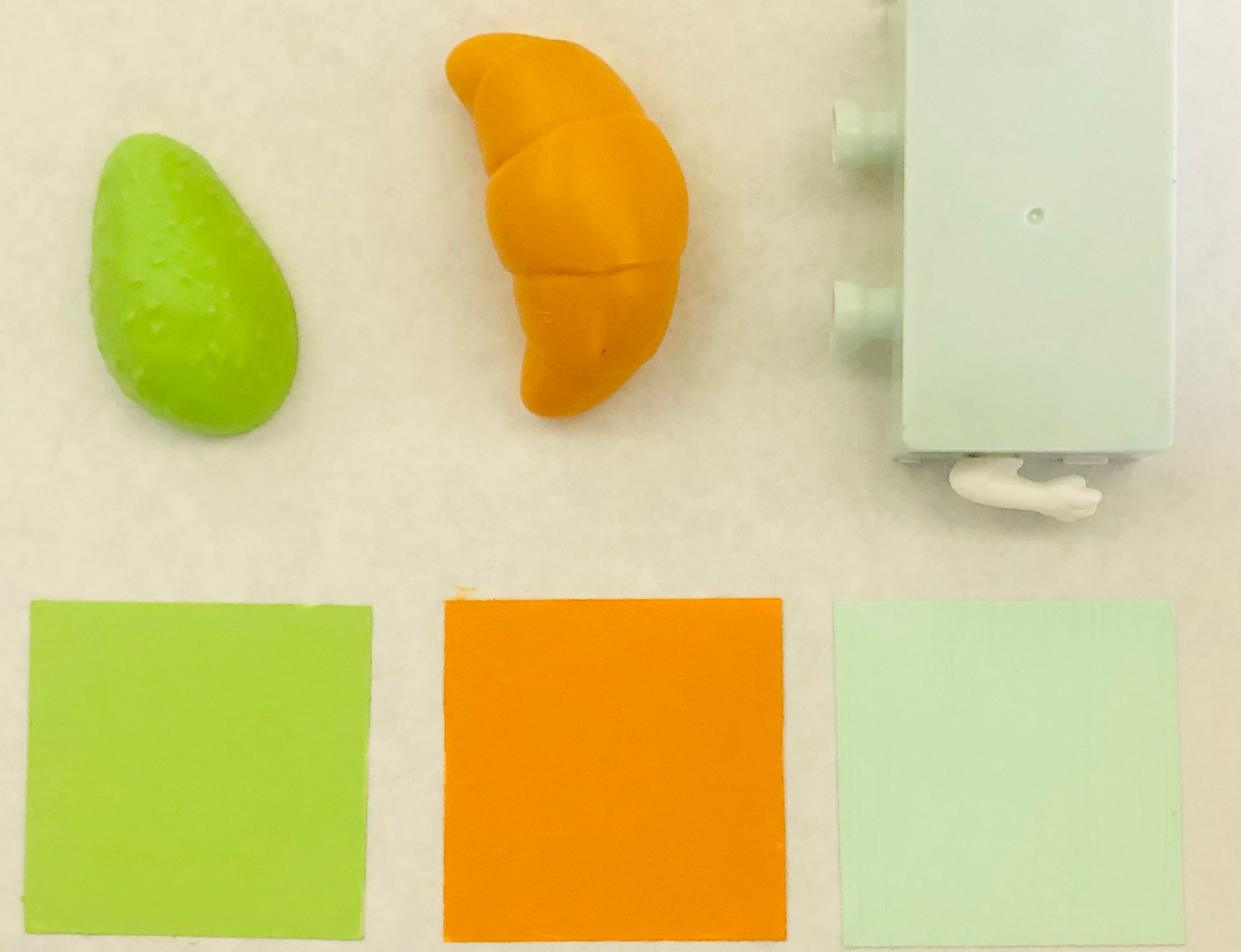
Color Match Study
Students bring an object and mix a color swatch to match hue, saturation, and value as closely as possible using only their primary color and black and white paints. They repeat the exercise for 3 objects total.
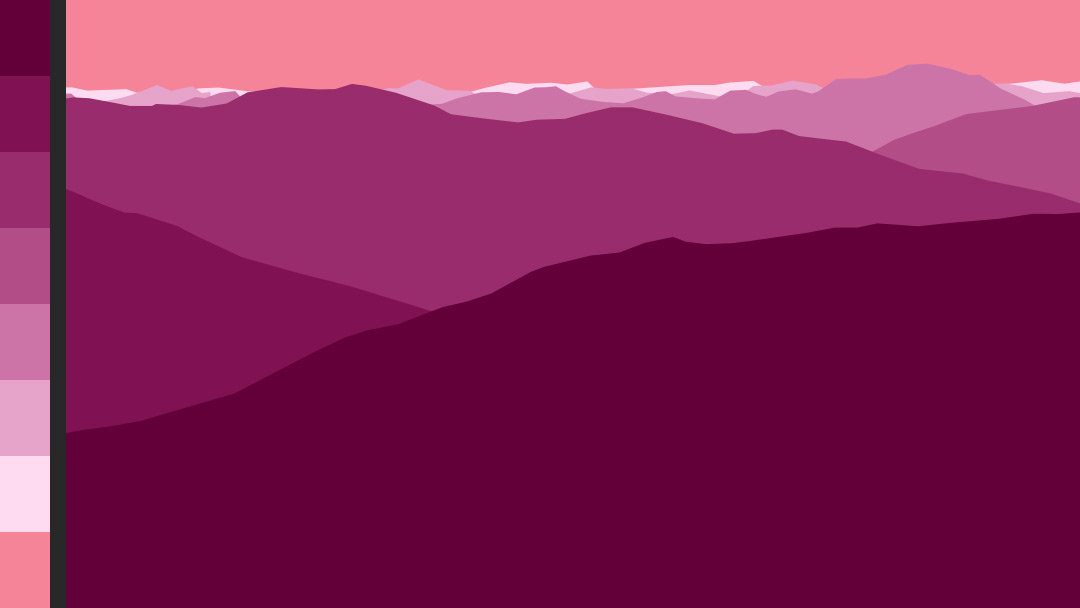
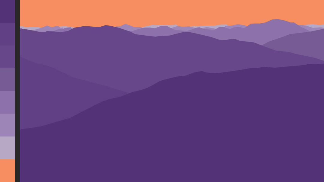
Digital Atmospheric Perspective Study
Students choose a base hue and adjust brightness and saturation to imply distance to a templated landscape scene. Students develop the skills to choose colors with precision in Adobe, and understand how to use atmospheric perspective in digital artwork.


Pixels & Palettes Digital Study
Students select an image to study and submit the title and artist/source. They manually simplify the image down to a 12×12 square ‘pixelated’ image. Then they simplify again to a 6-color proportional palette. We discuss an artist’s process of selecting, expanding, honing, and applying a color palette; this study approximates a reverse of the artist’s process.
Projects
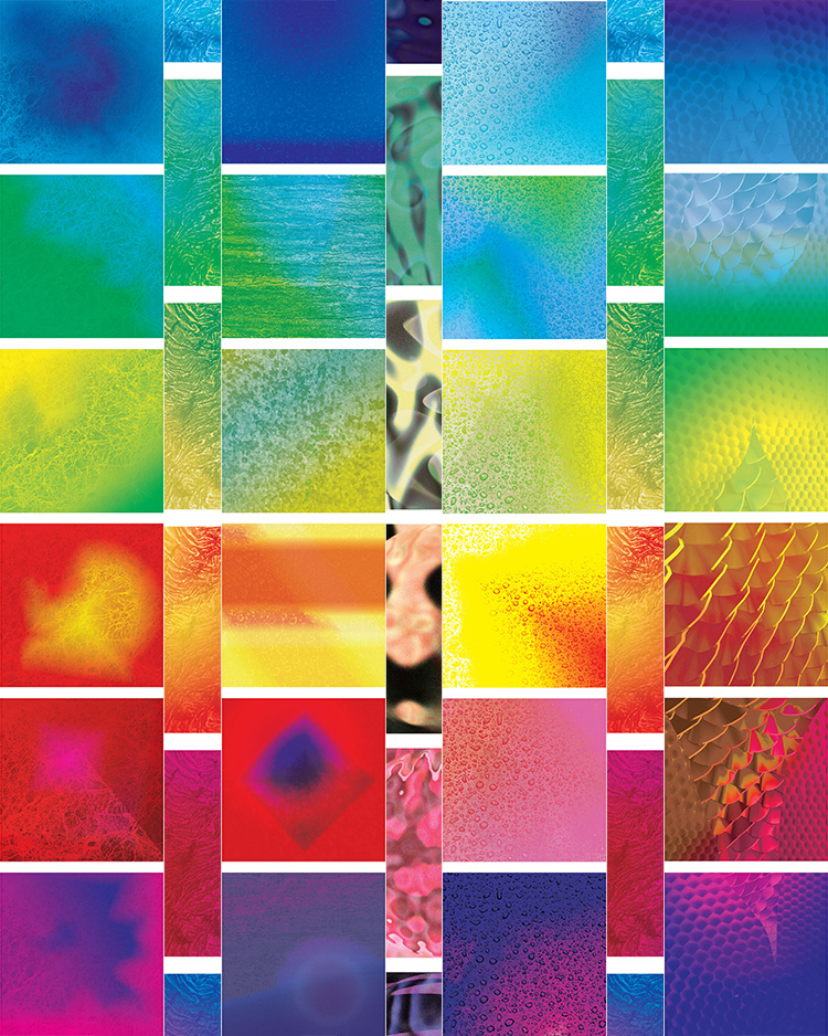
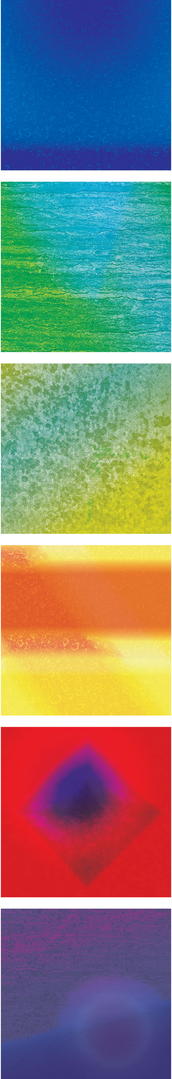
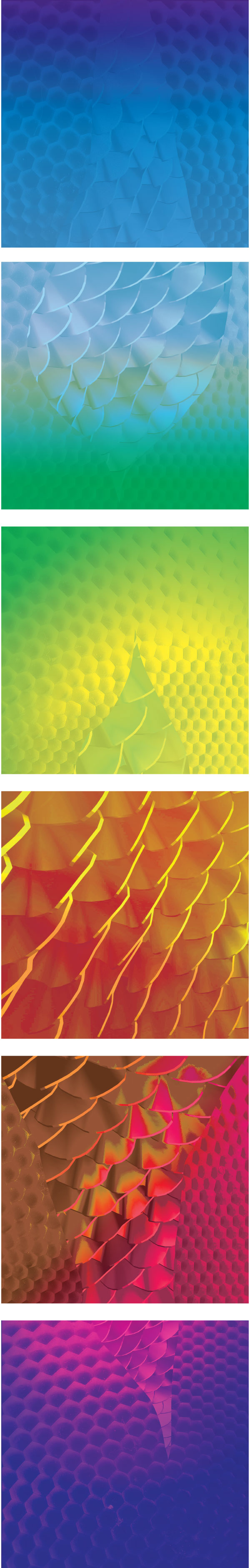
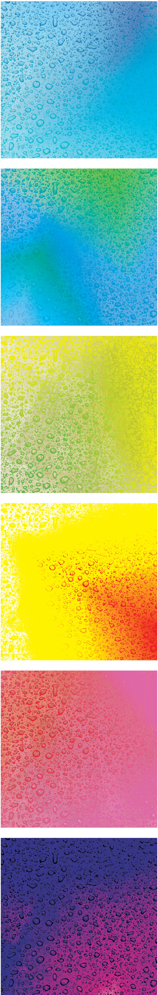
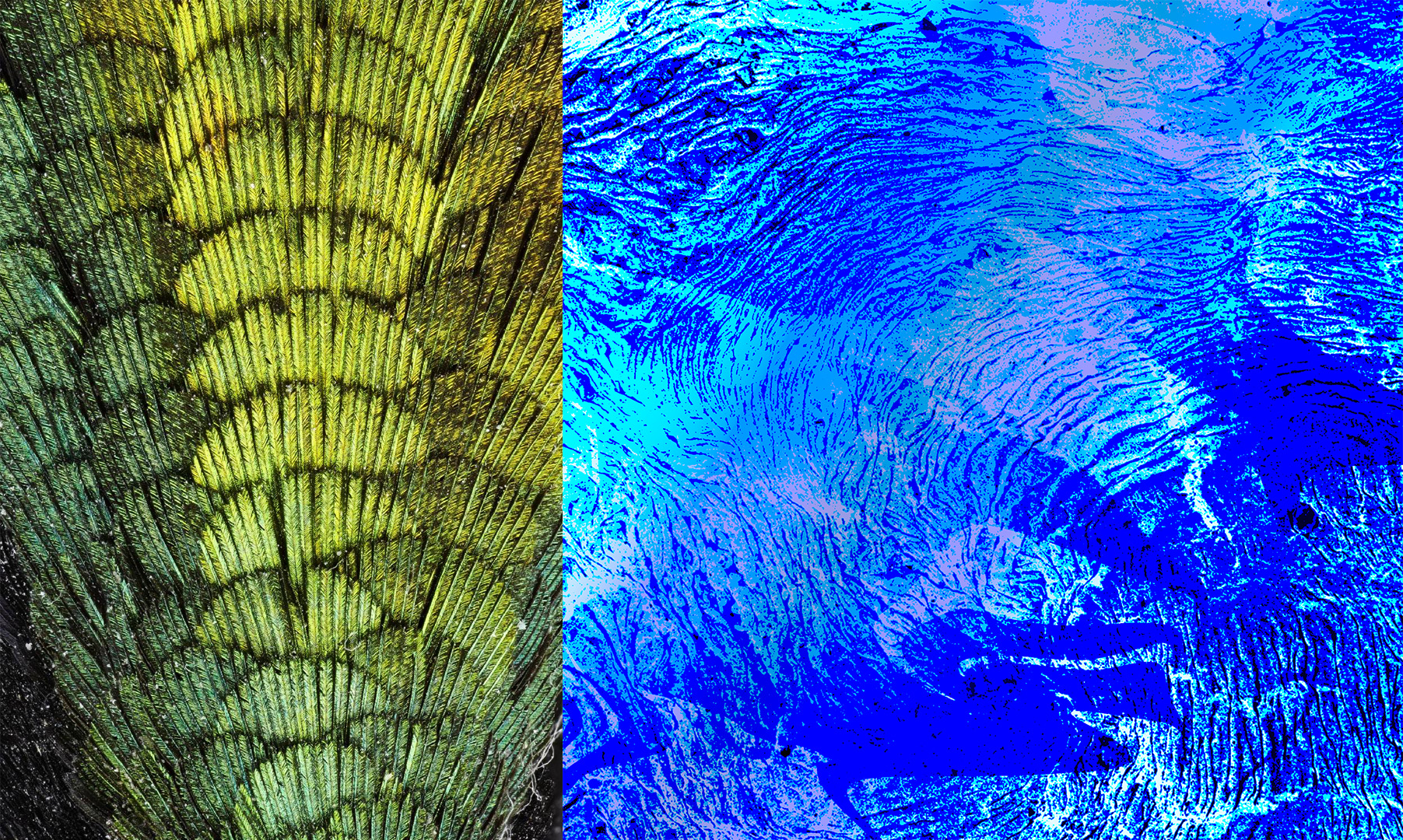
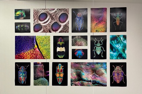
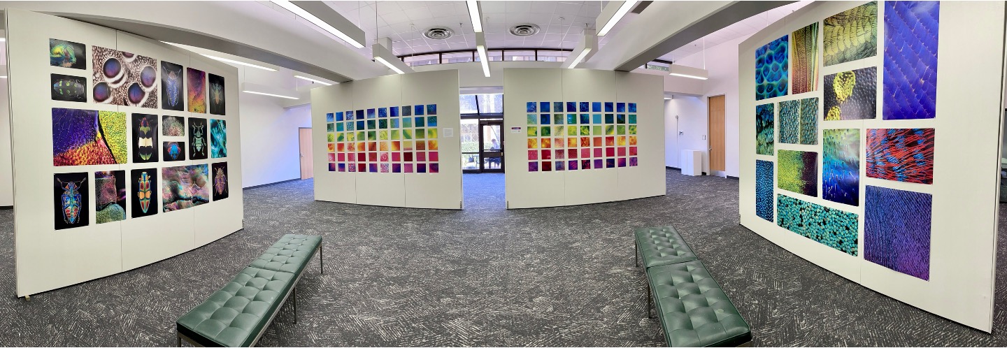
Iridescence Project & Exhibitions
This project was designed in collaboration with LSU Entomology Assistant Professor Dr. Nathan Lord. Students work with analogous color palettes and experiment with saturation and value. First, students learn about the science of iridescent coloration, next they look at examples of artistic exploration of iridescent phenomena, and finally they use Photoshop to combine texture, gradients, and blending modes to create visually dynamic color compositions. Each student produces a set of six cohesive images, each image spanning an analogous palette that together encompass the entire visible spectrum.
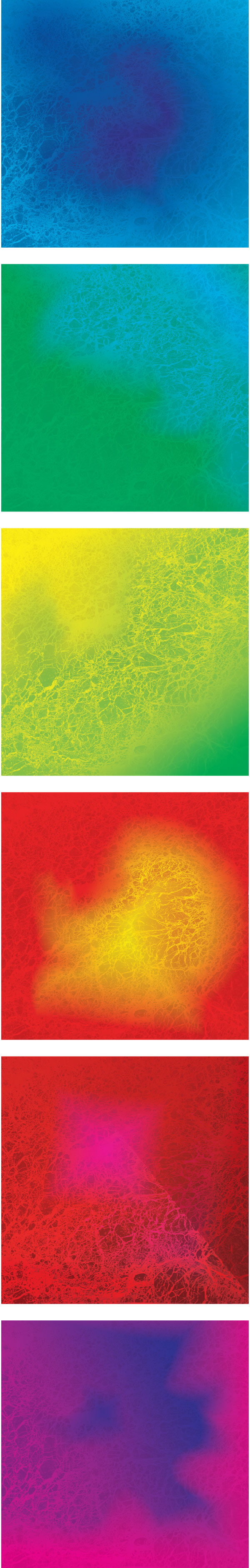
The final products for the first semester’s students (Fall 2021) were included in a year-long exhibition at the Louisiana Art & Science Museum’s Iridescence exhibit alongside work by world-renowned artists, scientists, and scholars. The second semester’s student work (Spring 2022) was featured in a month-long exhibition in LSU’s Boyce Gallery, along with photographs from the LSU Entomology Department’s research on iridescent insects.

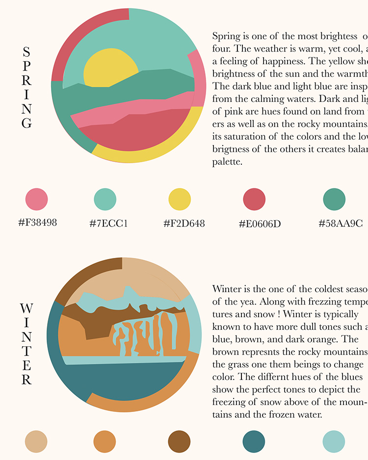
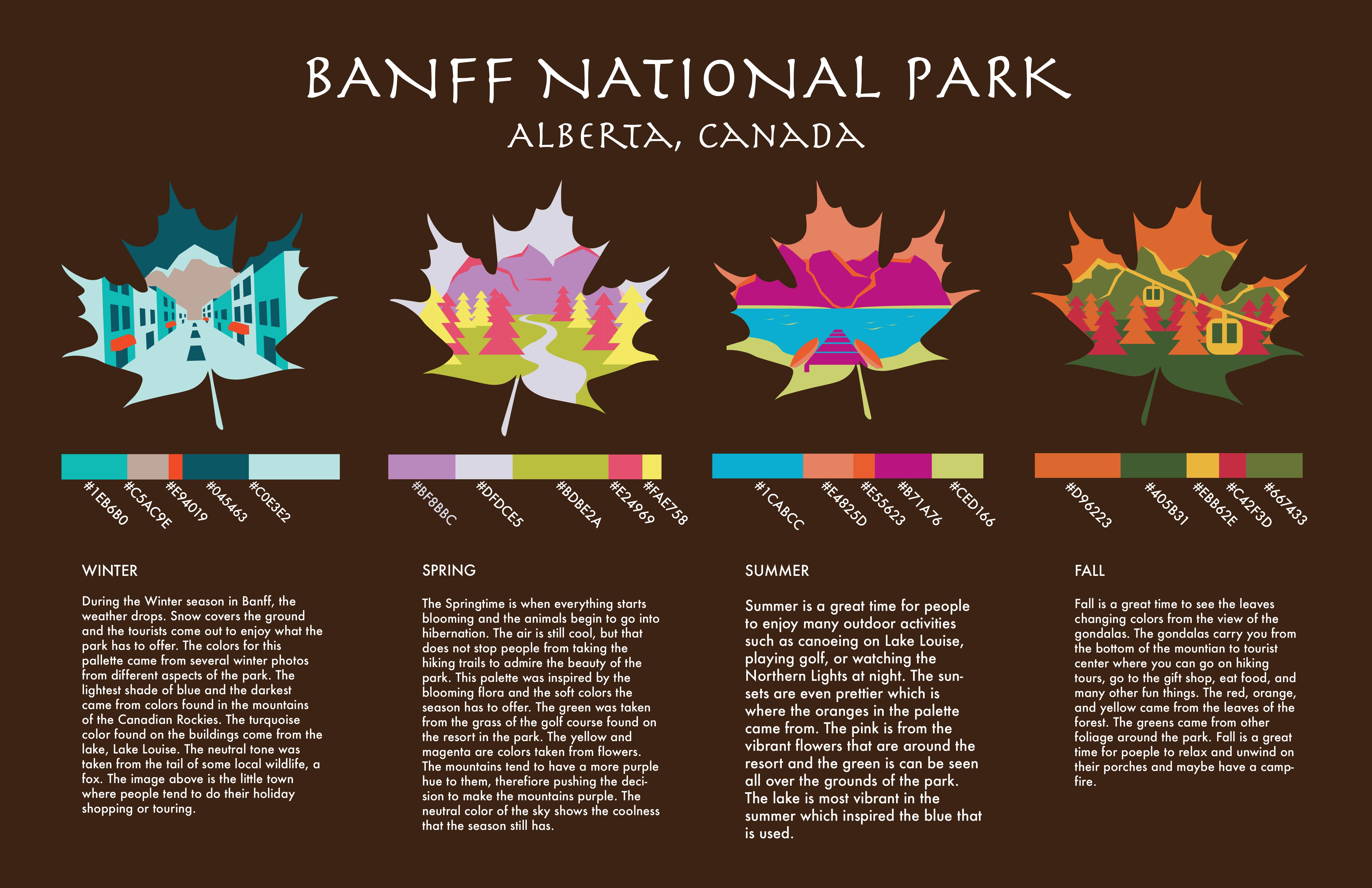
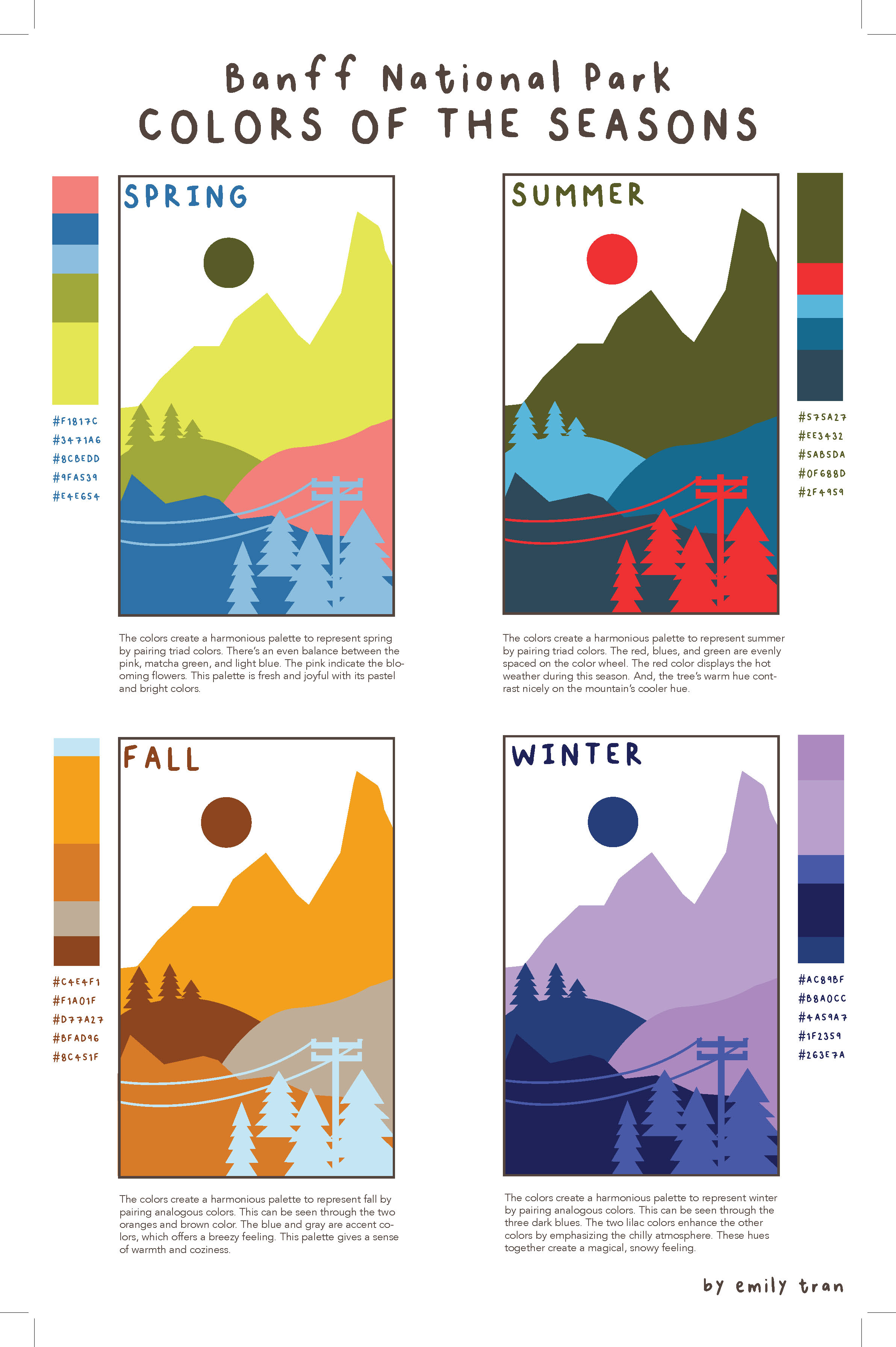
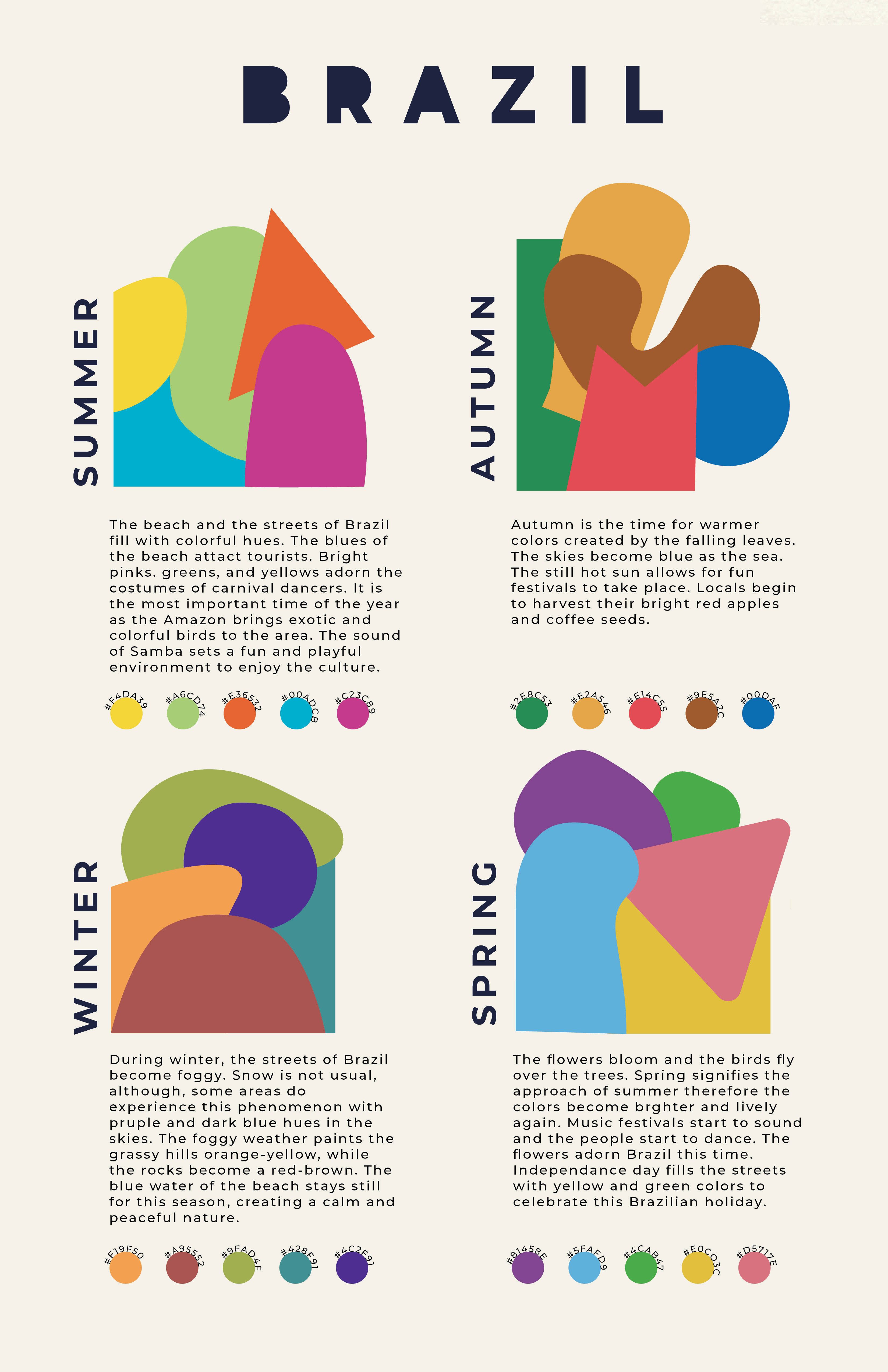
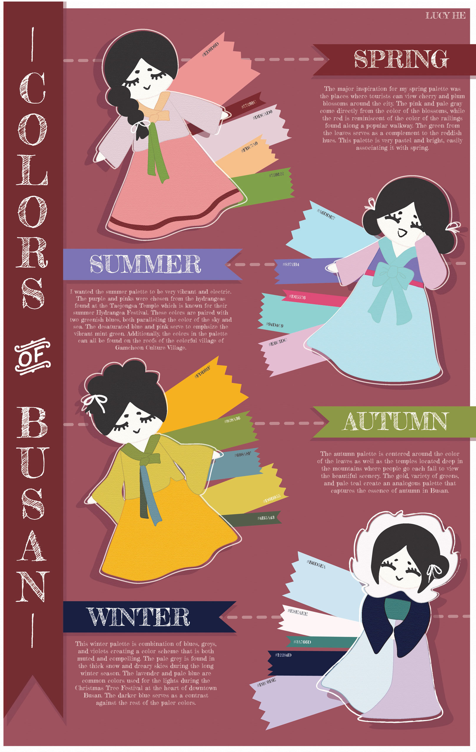
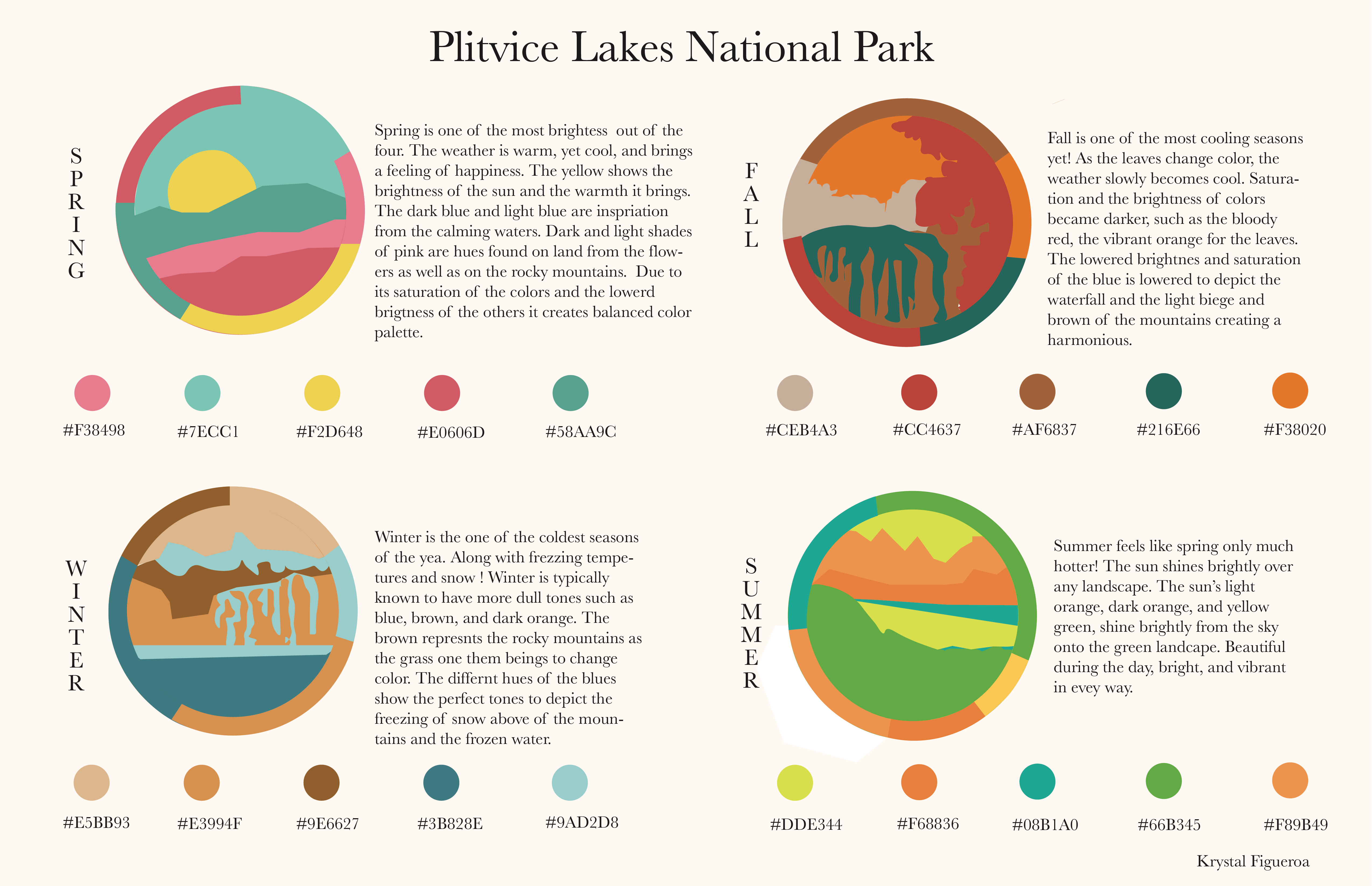
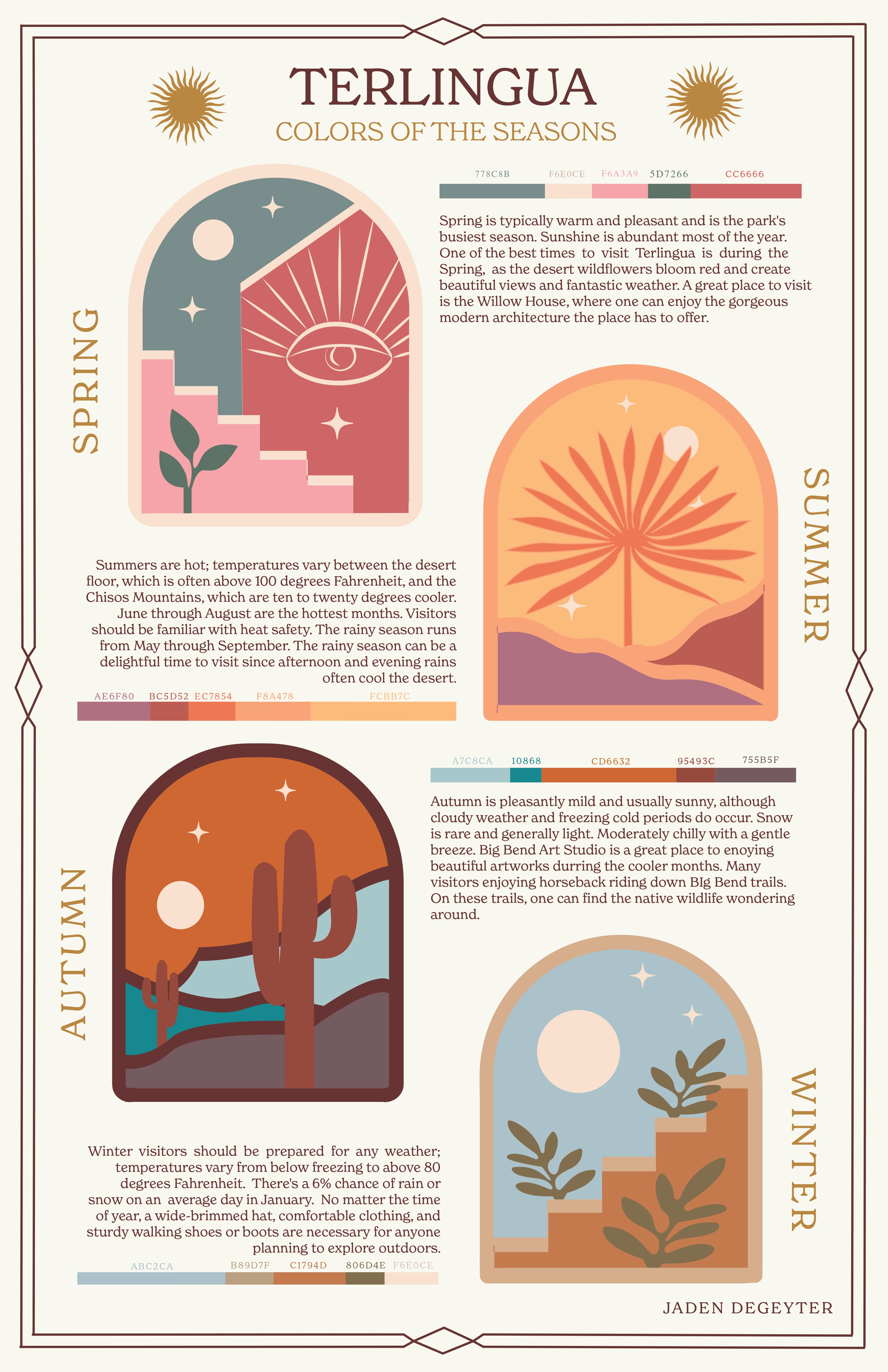
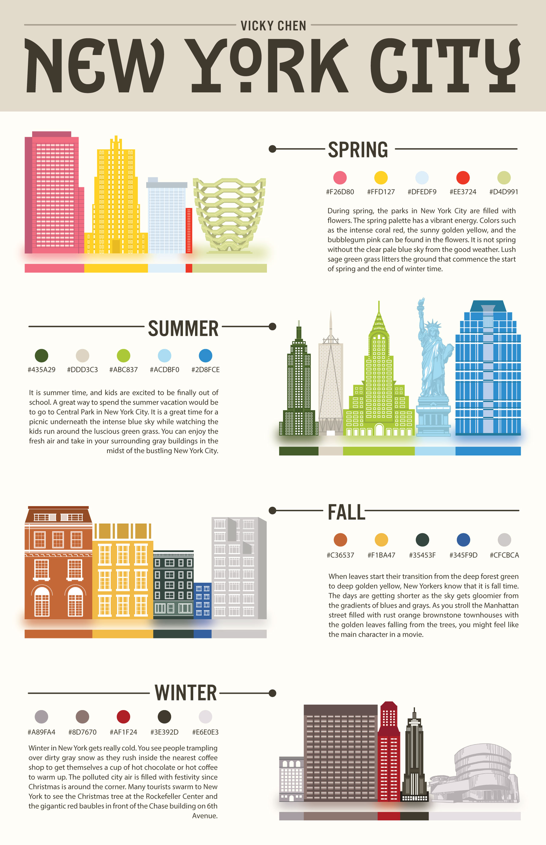
Seasonal Palettes Project
In this project, students choose a location and explore the way colors there change through the seasons. They research their location and build a mood board for each season, then build a 5-color proportional palette to represent that location for each of the 4 seasons. The final presentation is an 11×17 inch poster clearly presenting all 4 palettes including the HEX codes for each color, and a short description of how the colors represent the location’s seasonal changes. Each palette must make use of tint, shade, and saturation to achieve visual harmony.

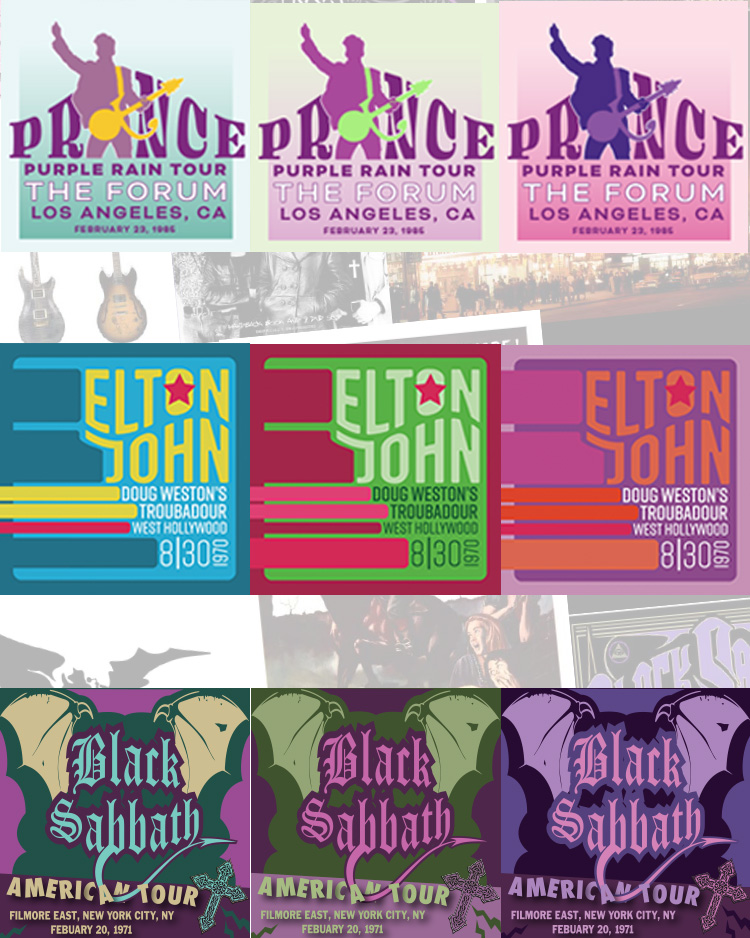
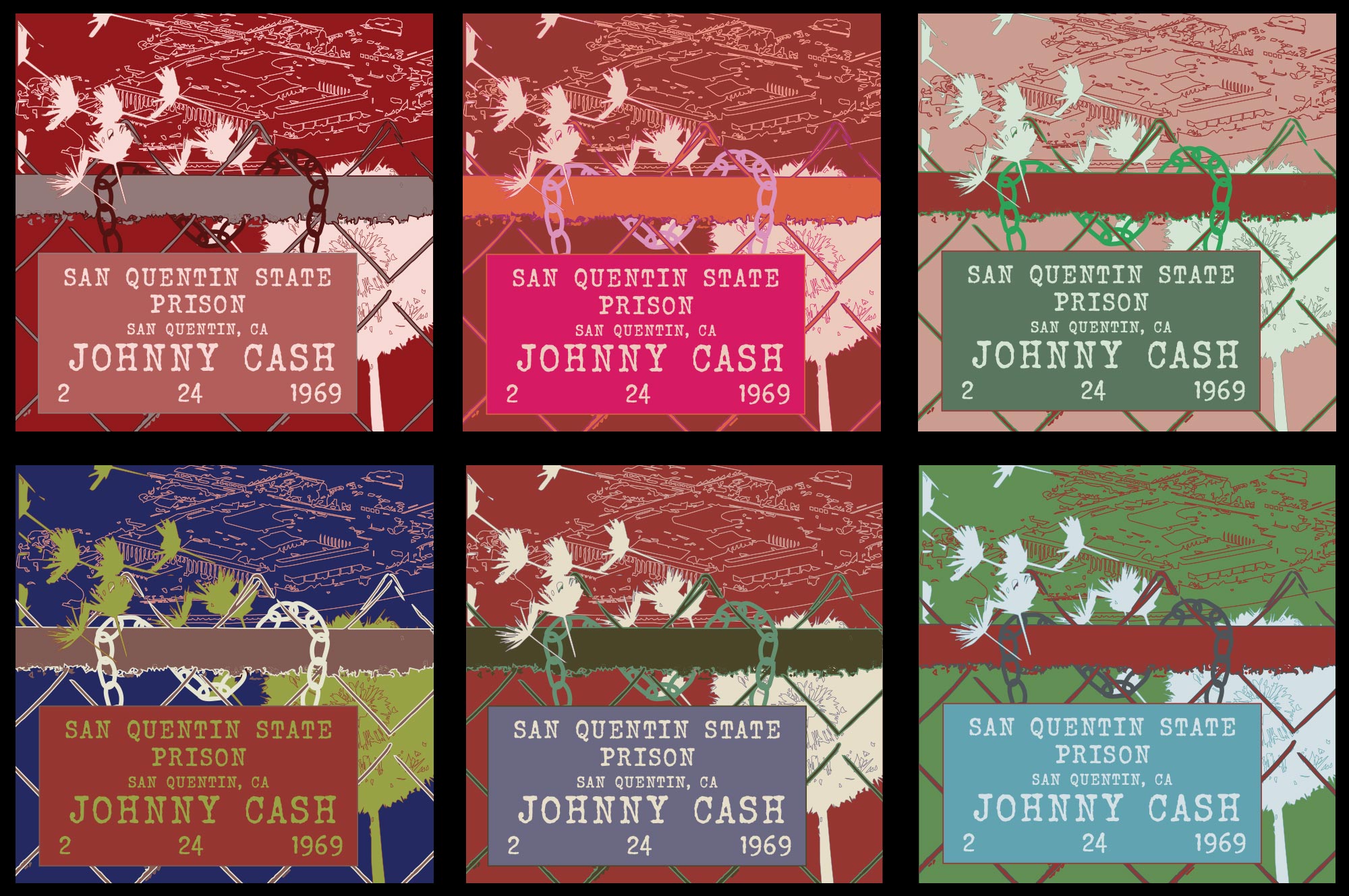
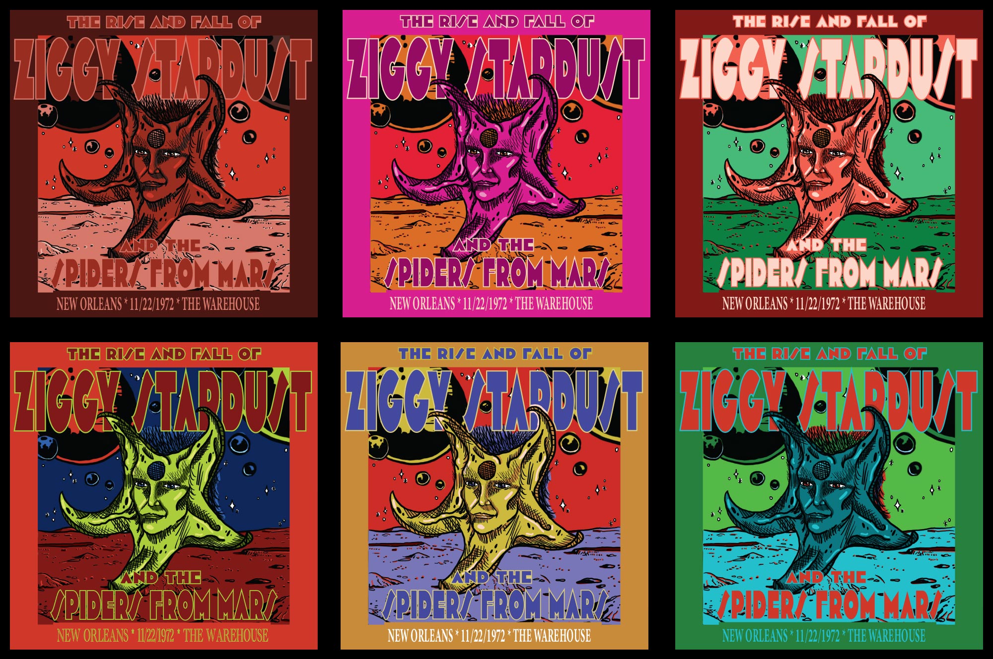
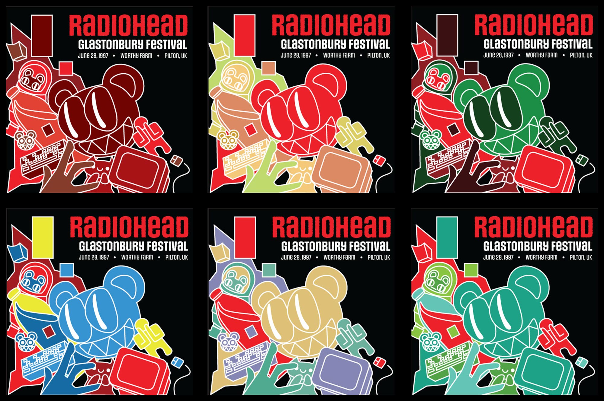
Tunes & Tones
In this project, students select from Rolling Stones’ list of the 50 best concerts of the last 50 years. They research the musical artist, the era, the audience, and more to create a mood board and select a single key color. They design a square promotional graphic for the concert, and apply each of 6 color harmonies using their key color to the same graphic. Students grapple with the varying complexities of each harmony, and utilize value and saturation in each application to maintain legibility and emotional impact.

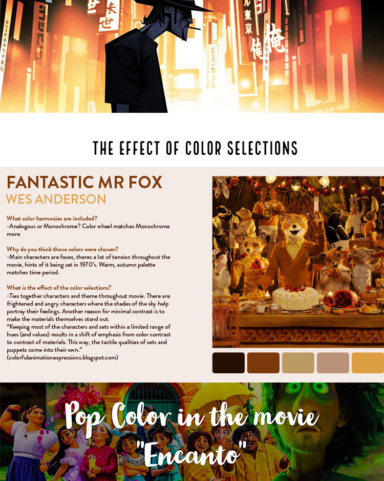
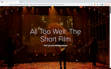
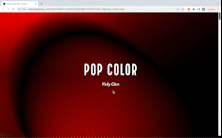
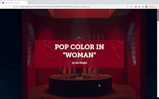
Pop Color Assignment
In this assignment, students select an example from pop culture (album art, music video, film, video game, etc.) to analyze. They demonstrate understanding of color harmonies, color psychology, and color as a tool rather than just decoration as they explain the colors used, their intended effect, and their practical outcomes. Students may choose to present their findings in person using whatever visual means they like and engaging the class in discussion, practicing their oral communication skills; or they may choose to use Adobe Express to create a webpage showcasing their findings and practicing their written communication skills. Samples below are from students who chose to use Adobe Express.
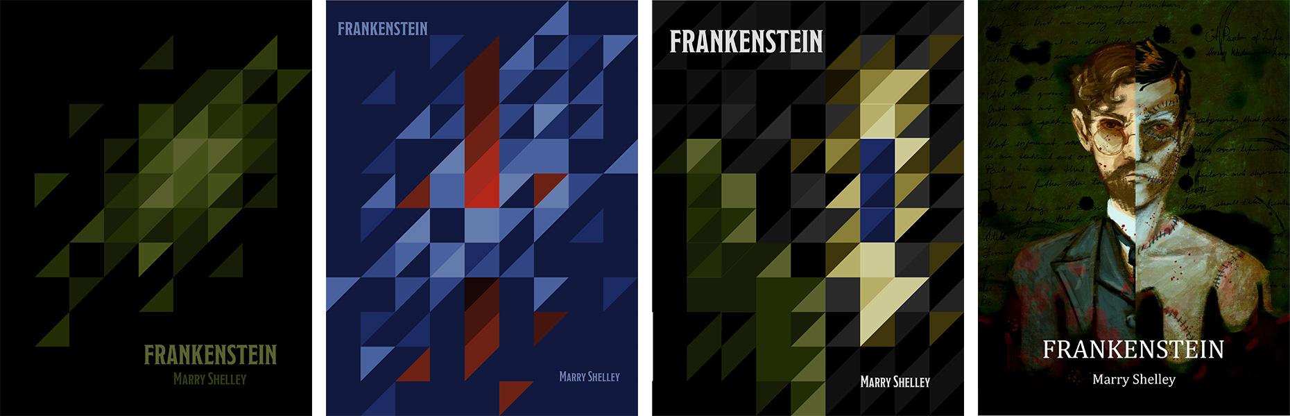
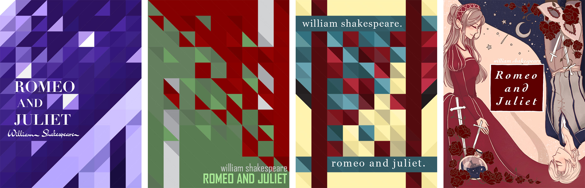
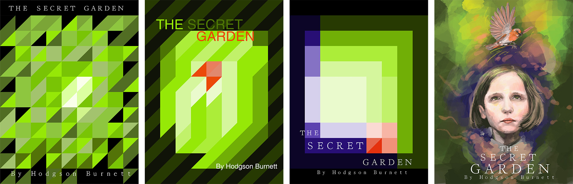
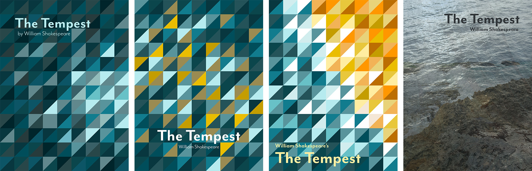
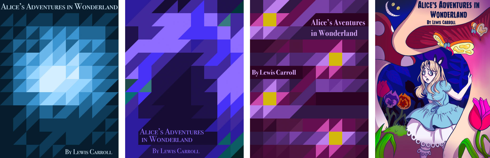
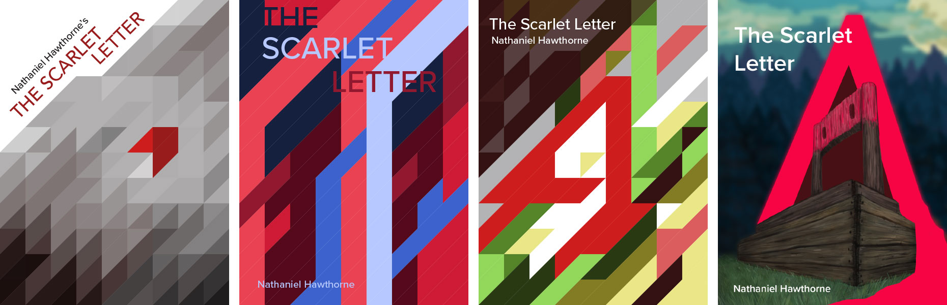
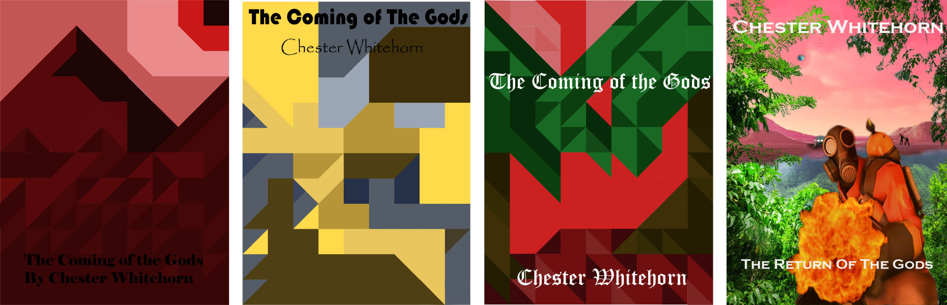
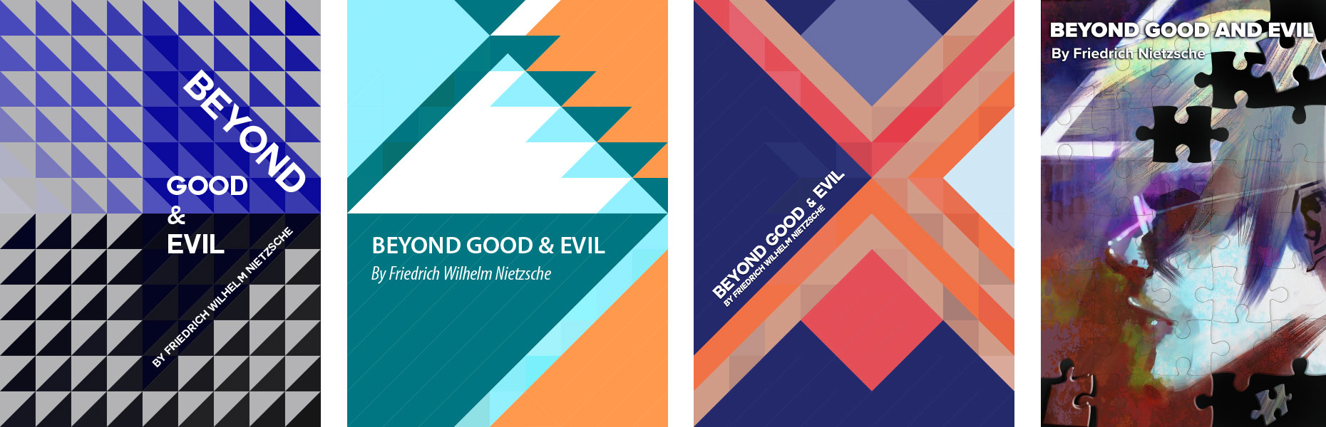
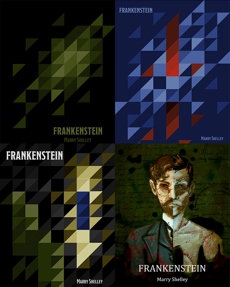
Book Covers
Book covers give readers a small peek into what they’ll experience in the story. For this project students design four covers for a single book. They each select a book which is in the Public Domain. Students then use color to communicate a message to the reader about plot, character, or emotional tone. A gridded template is provided for the first three covers. Cover #1 uses only one hue, #2 uses only two hues, and #3 uses only three hues. Cover #4 is a wild card—any combination of hues is fair game and students may use whatever media they prefer. This project gives students a chance to apply their new knowledge of color psychology and geometric abstraction, and to explore how color can help set a tone and tell a story.