Art 2551 (LSU) – Type for Visual Communication
ART 2551 is the single course in typography for visual communications students and an introduction typography course for graphic design students. Students gain an understanding of typography in historical contexts through discussion of its main technological advancements and pioneers, from Gutenberg’s printing press to contemporary typographers and digital applications. This course moves from the micro—the anatomy of letterforms—to macro—larger bodies of text as whole. We examine formal practices in typography, such as hierarchy, defining grid structure, letter spacing, multi-page layouts, and the relationship between type and image.

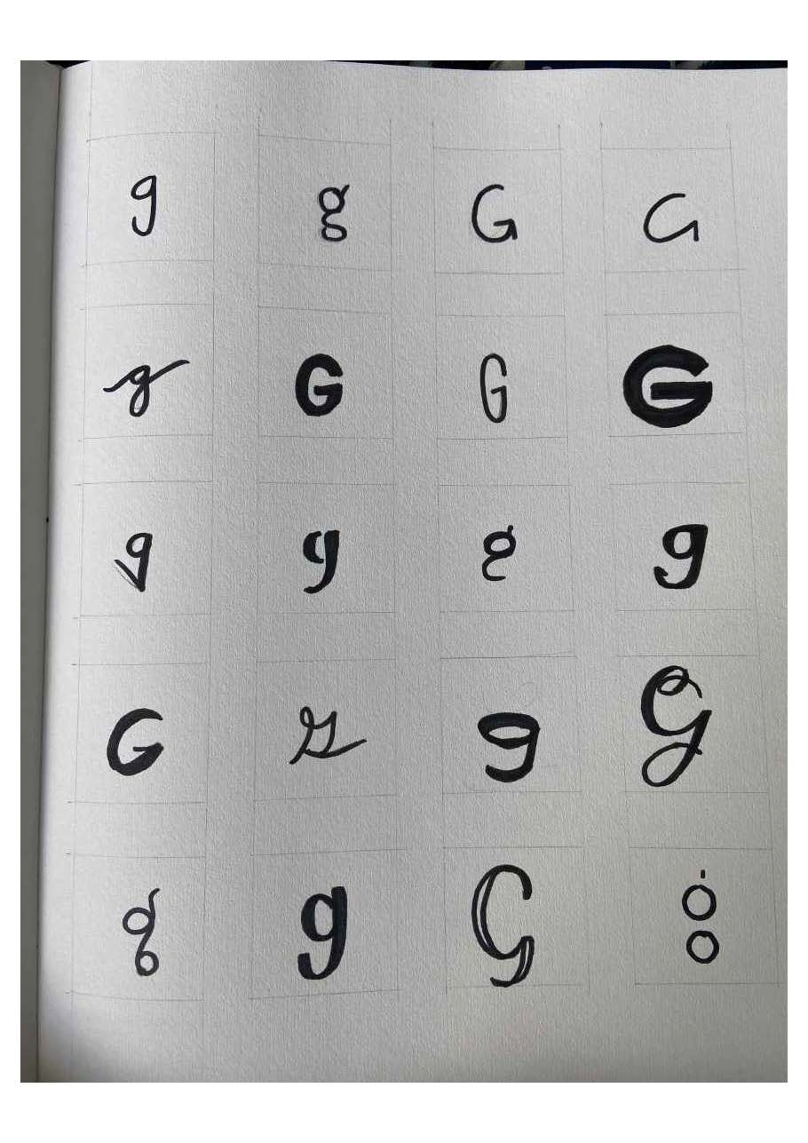
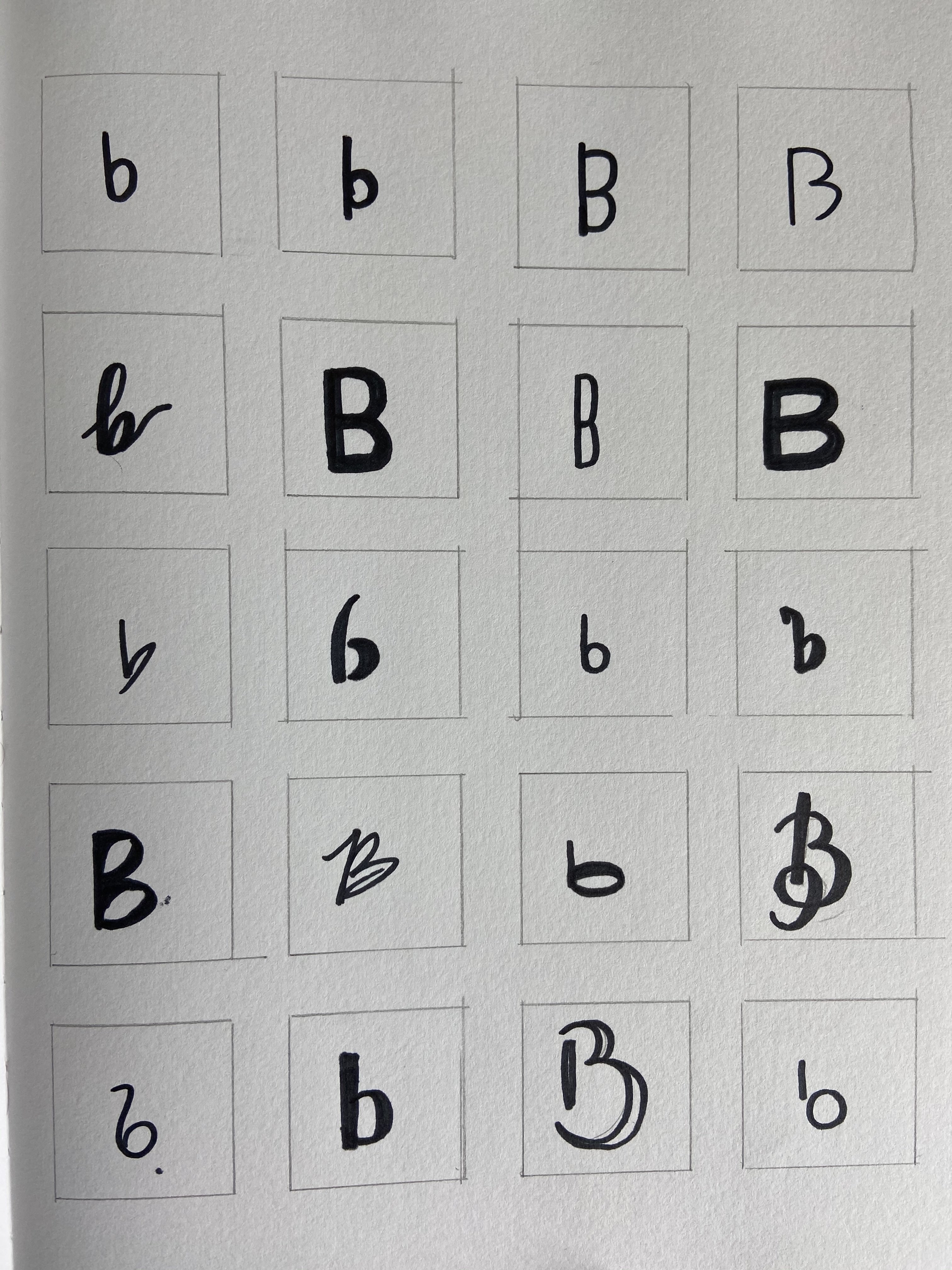
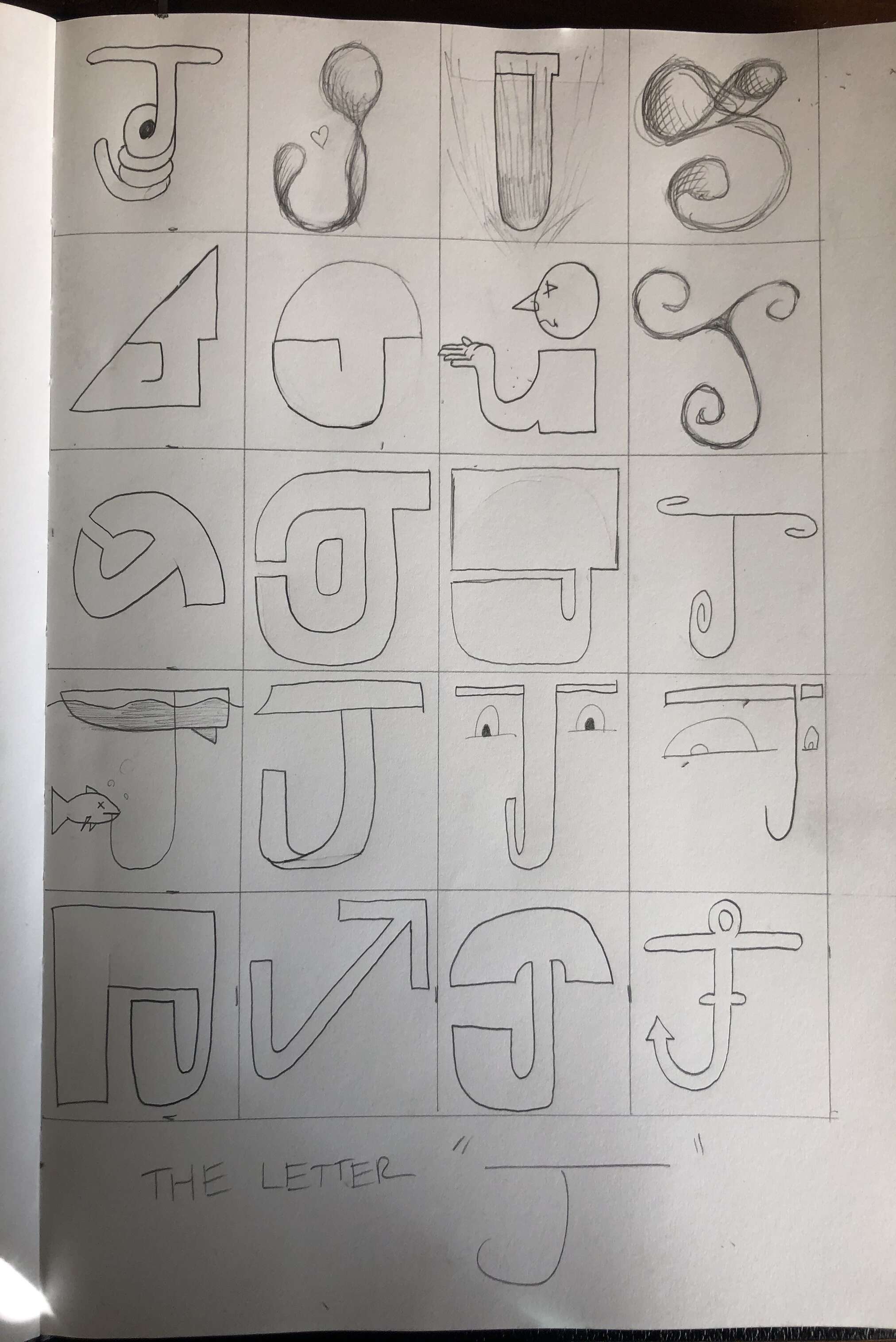
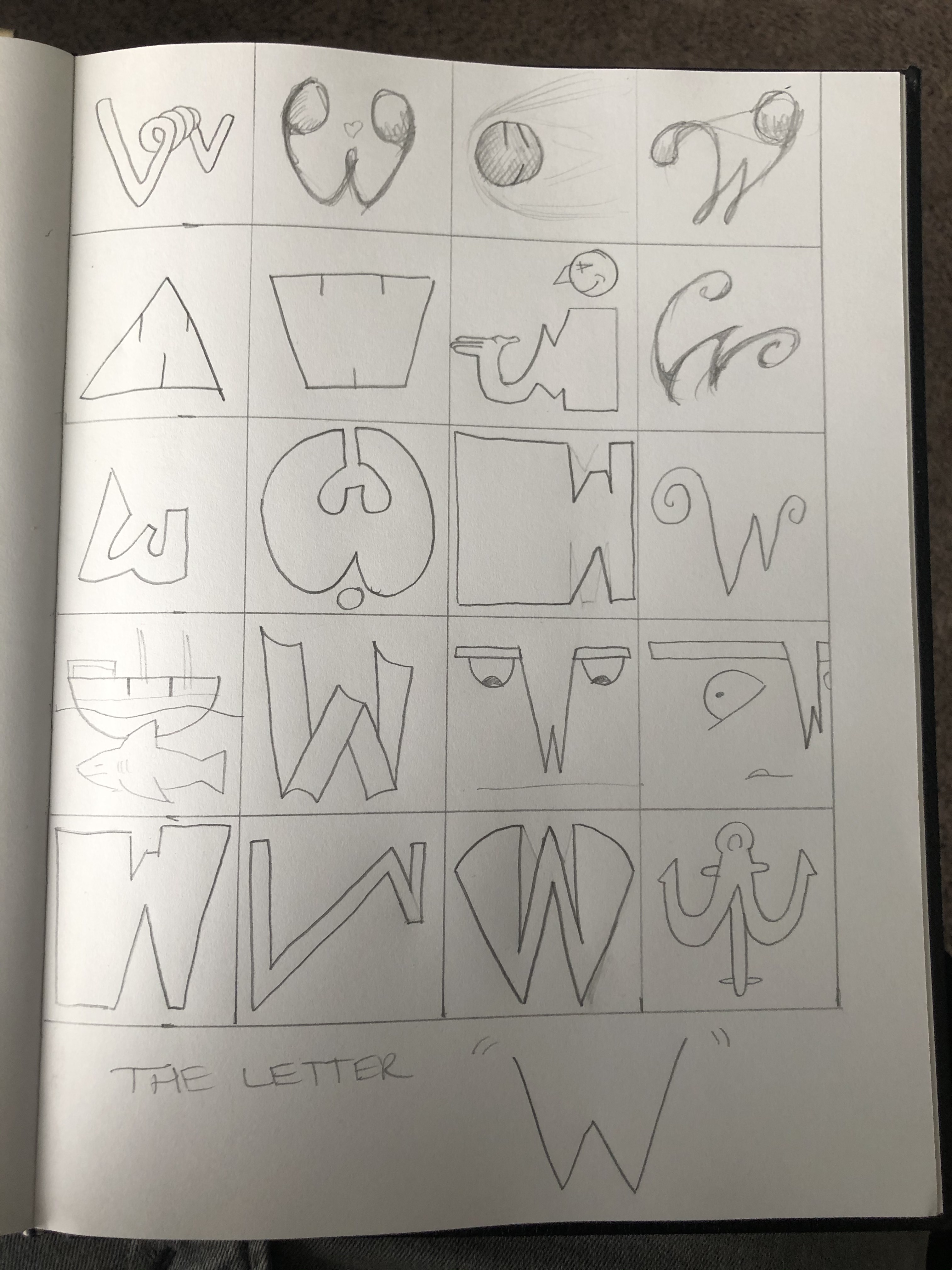
Letterform Variation
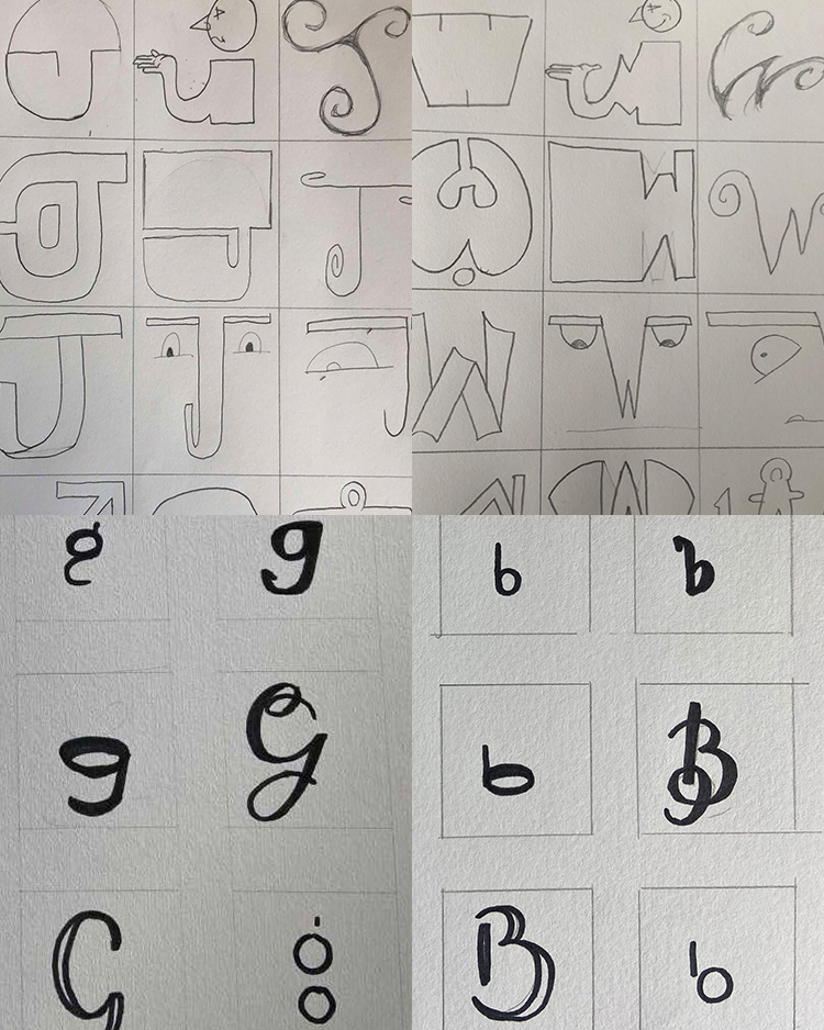
Students choose a single letter and draw it 20 different ways using whatever media they want. A week later, they’re asked to choose a different letter and draw it 20 times, matching the 20 styles they used in the first exercise. Students quickly gain an appreciation for the wide range of tones and styles that can be achieved in font design, as well as a sense of the stylistic and form details that tie a font’s glyphs together.
Grid Work
Grid Hunt
Students are given two-page spreads and asked to identify the space each piece of content takes up on the page. Then they set up the margins and columns in InDesign to find the settings that match that spread.
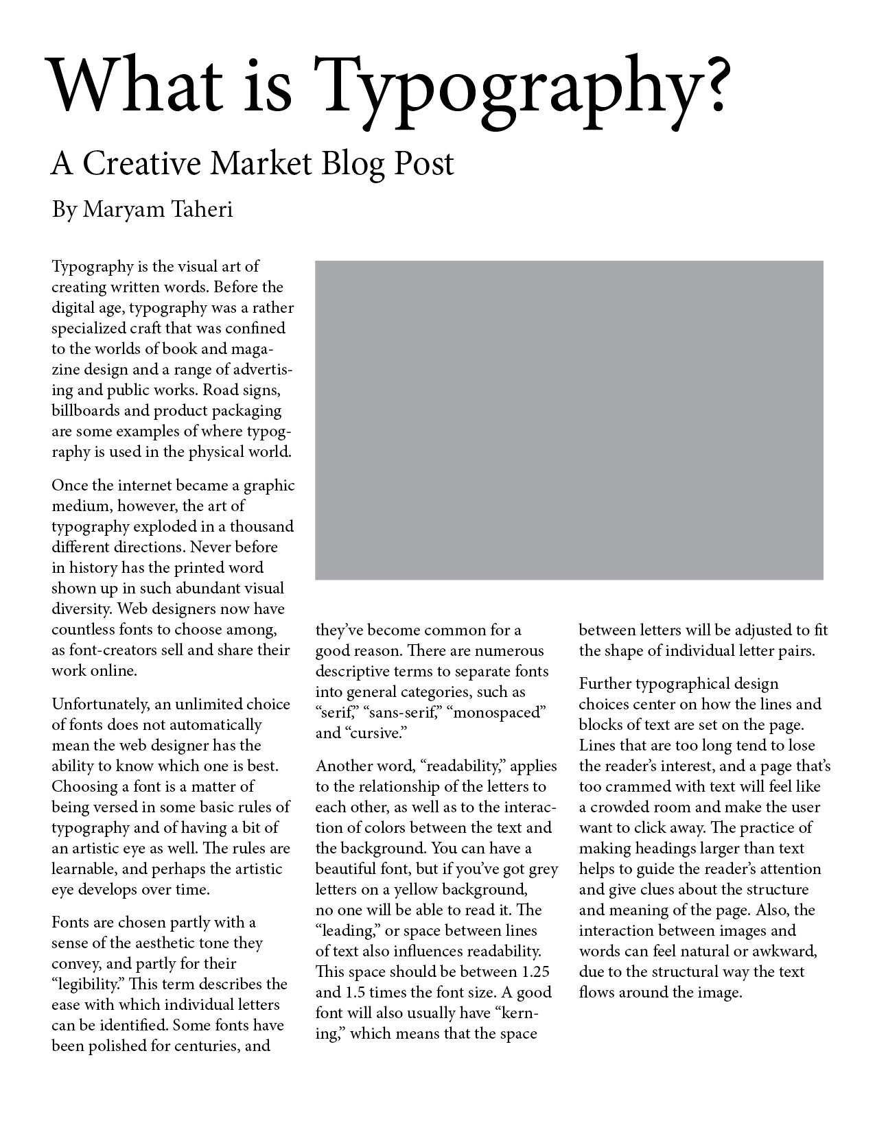
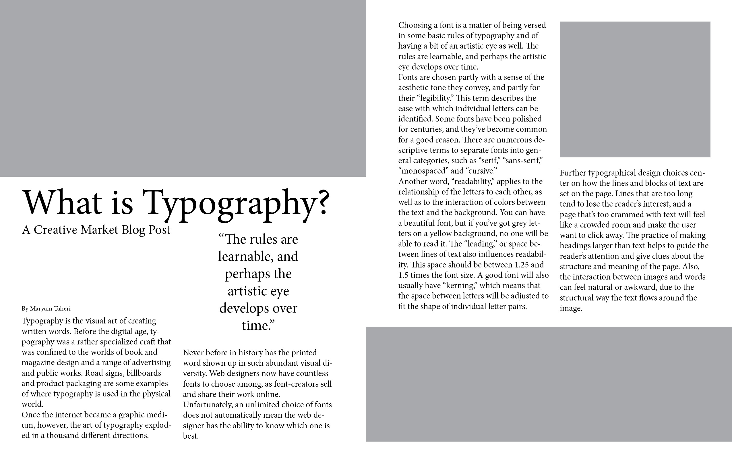
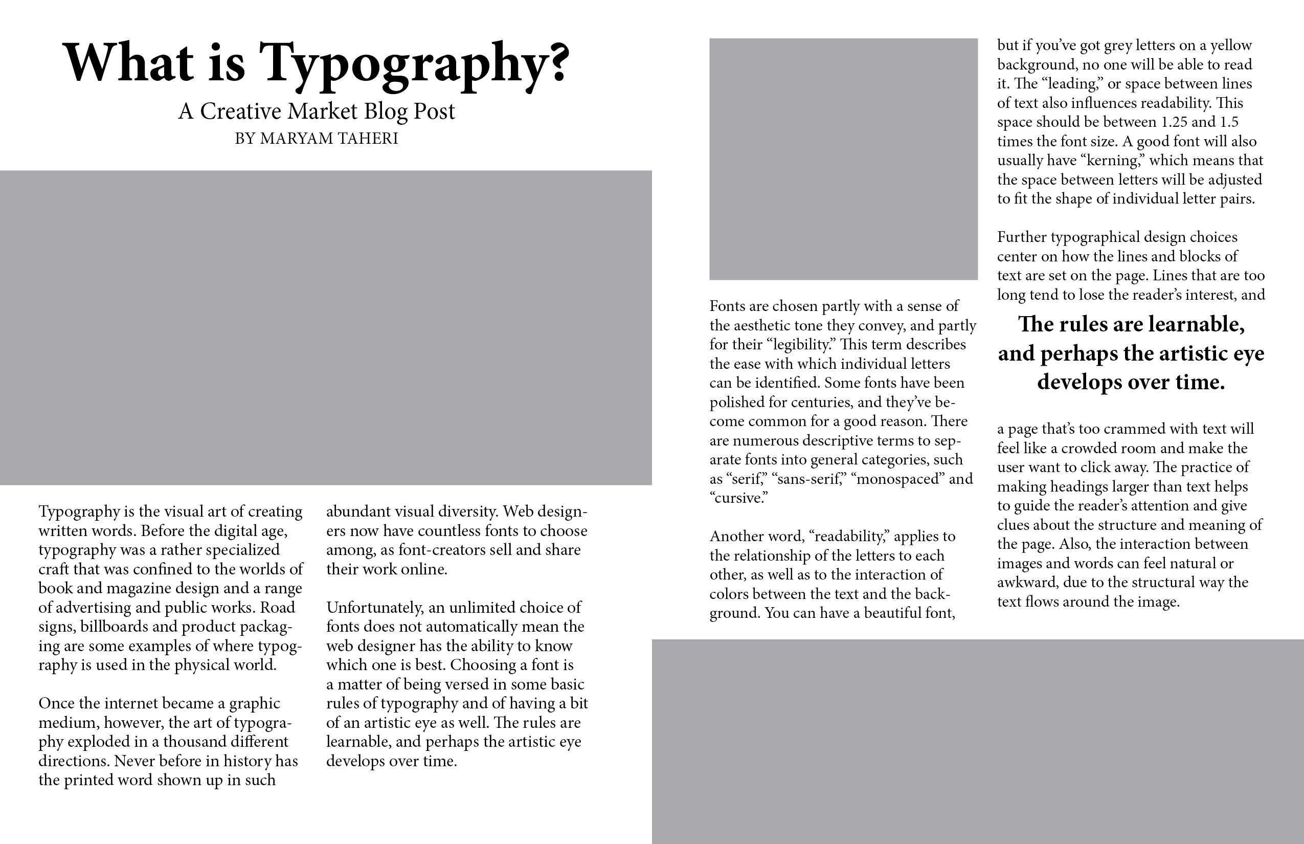
Grid Work
Students are given an InDesign document with unformatted content and asked to establish a hierarchy and utilize a basic columnar grid to organize the page. This is the first time using a grid for nearly all students in this course.
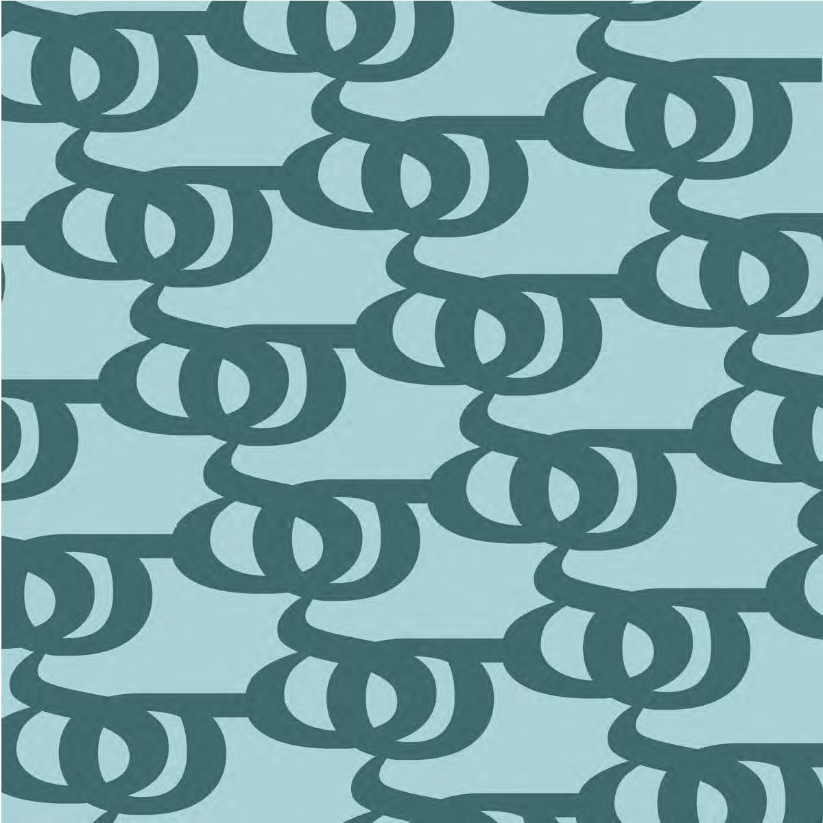
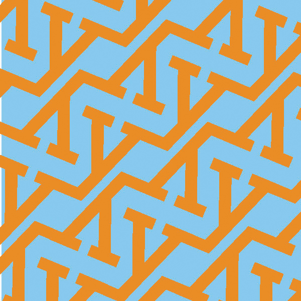
Letterform as Image Project
Part 1: Zoom
Students choose a single letter and zoom in enough to obscure recognition of the letter without completely losing it. Students learn to consider the viewer’s experience as well as what parts of letterforms are essential to comprehension.
Part 2: Repeat
Students choose a different letter and repeat it to create a dynamic pattern. Students learn to appreciate the form itself and ways that letterforms can interact creatively.


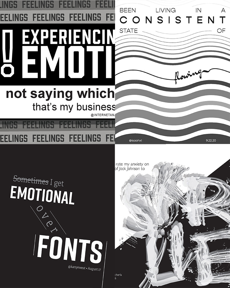
Tweet Type / Malaphors Projects
In this project, students create an 8×10 inch graphic using two typefaces in grayscale. In the process, they practice simple information hierarchy, discover how a typeface can empower communication, and learn how to pair two typefaces for visual harmony and emotional effect. This is the first time using Adobe InDesign for most students in the course.
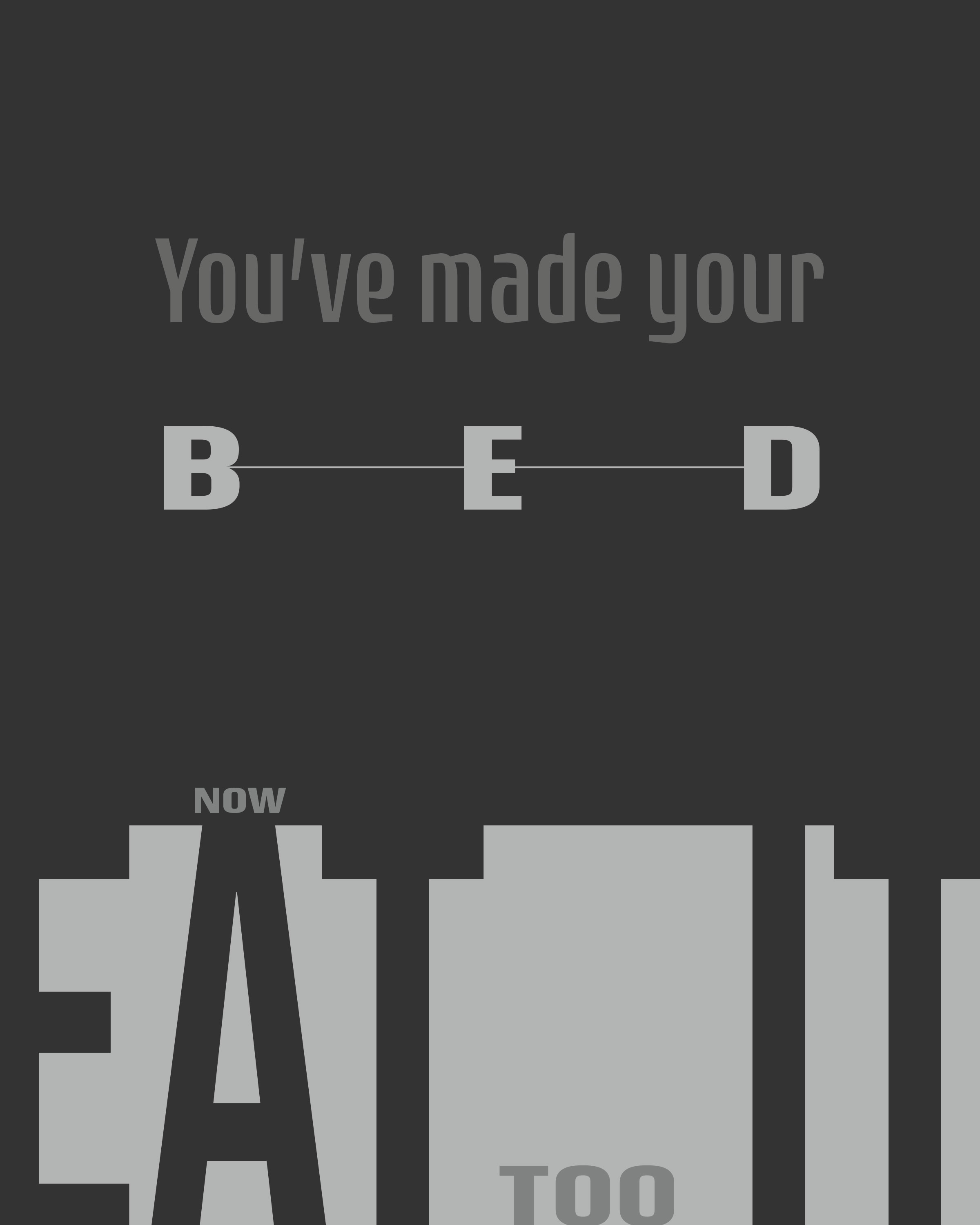
In the original project iteration, “Tweet Type”, students select a text-based tweet and analyze its tone and message. In the updated project iteration, students choose or create their own “Malaphor” (a mismatch of two aphorisms, which together create a nonsensical or humorous statement) to analyze and plan their application of emphasis.
Tweet Type
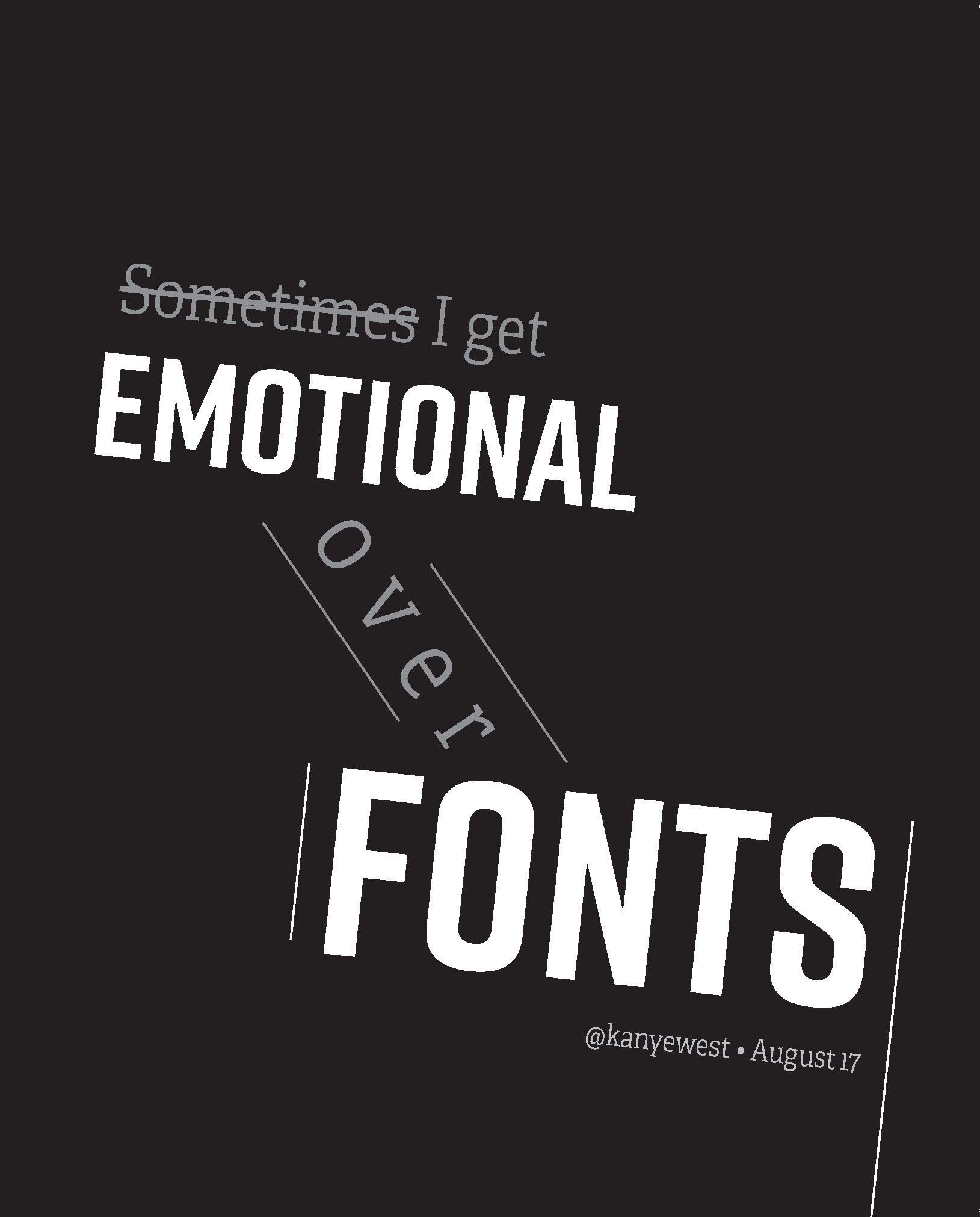
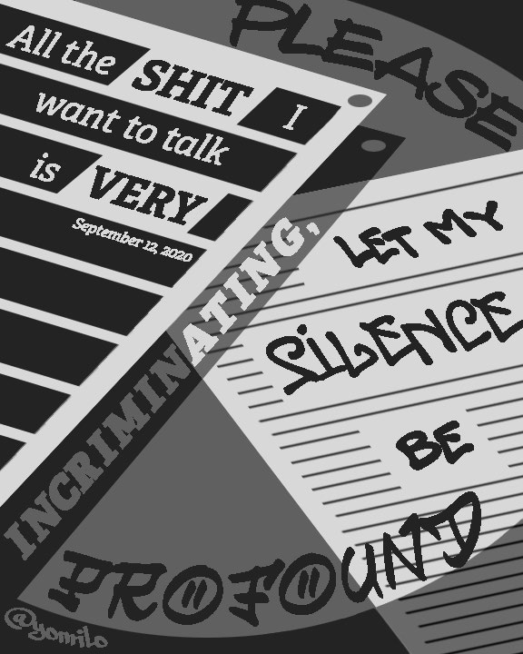
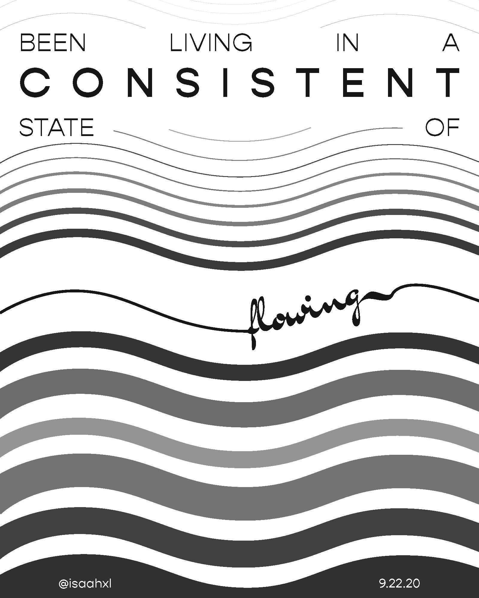
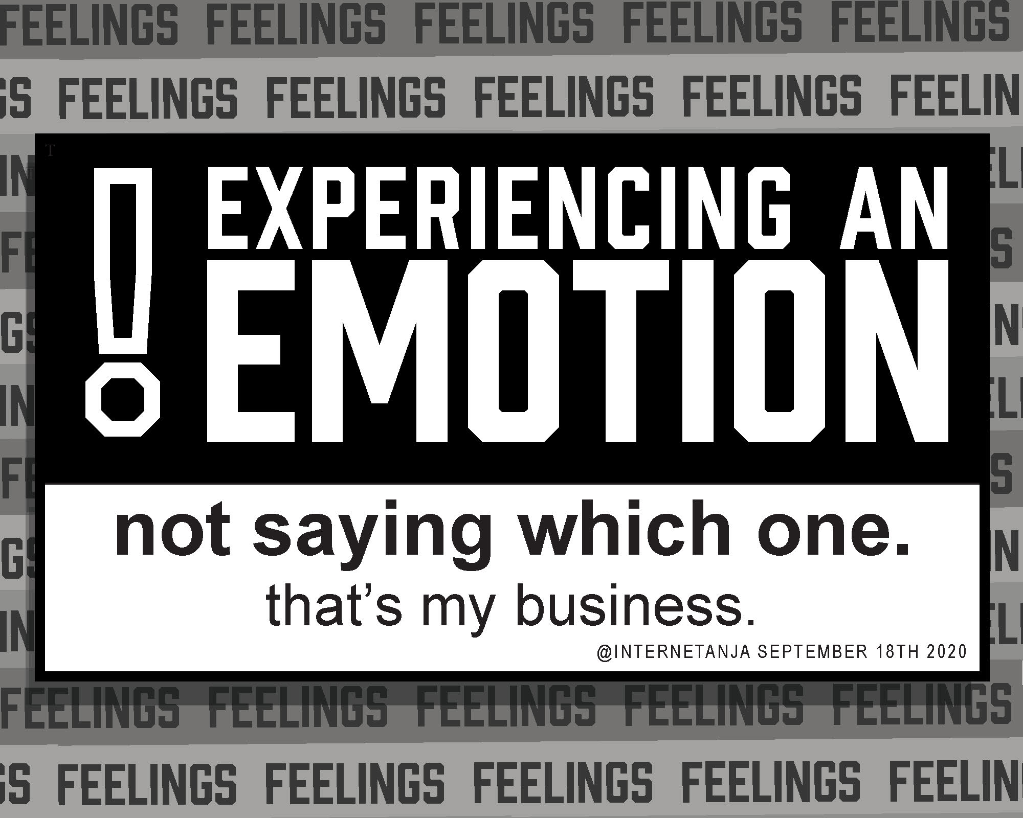
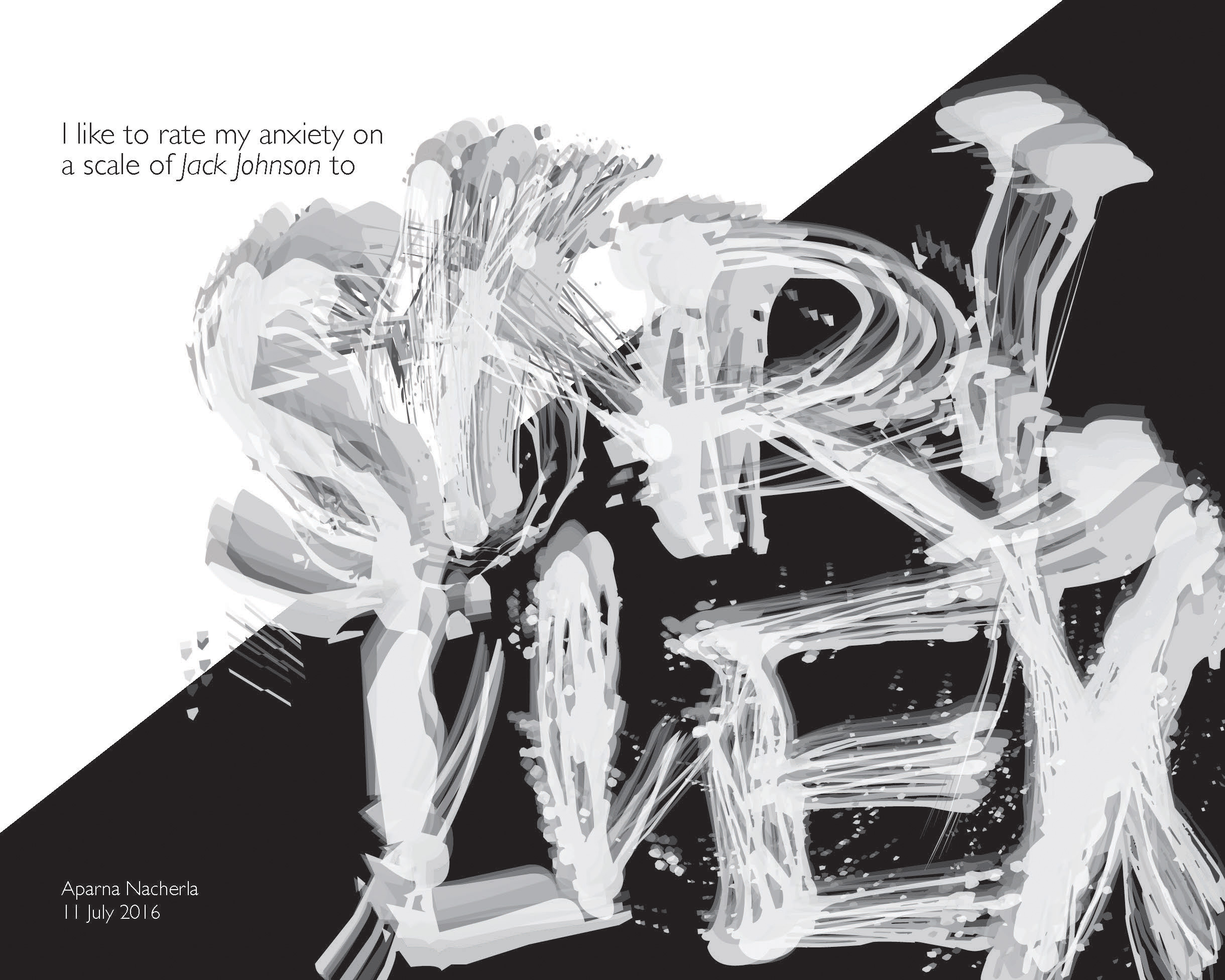
Malaphors
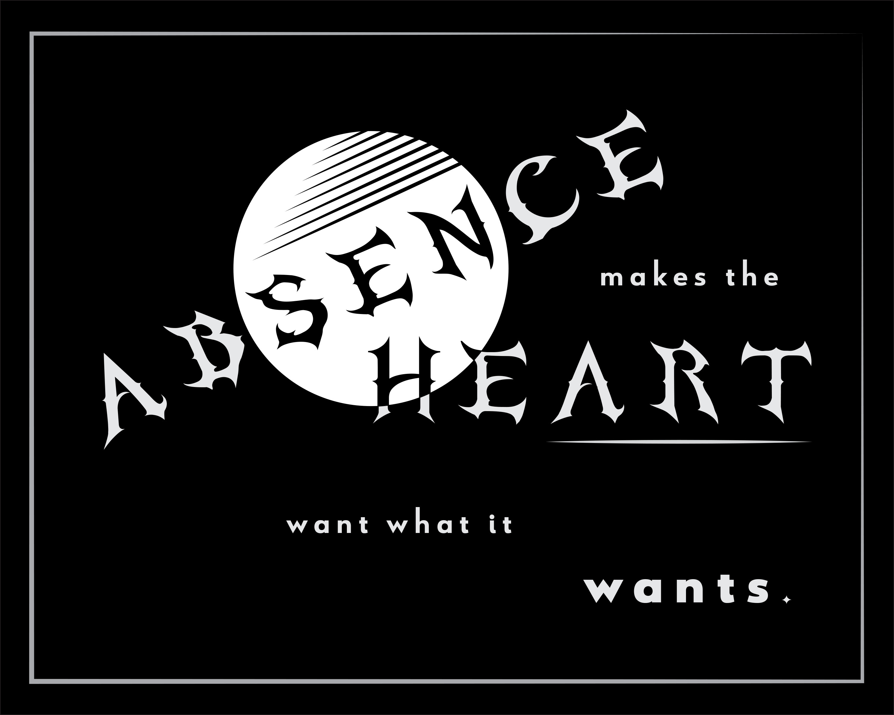
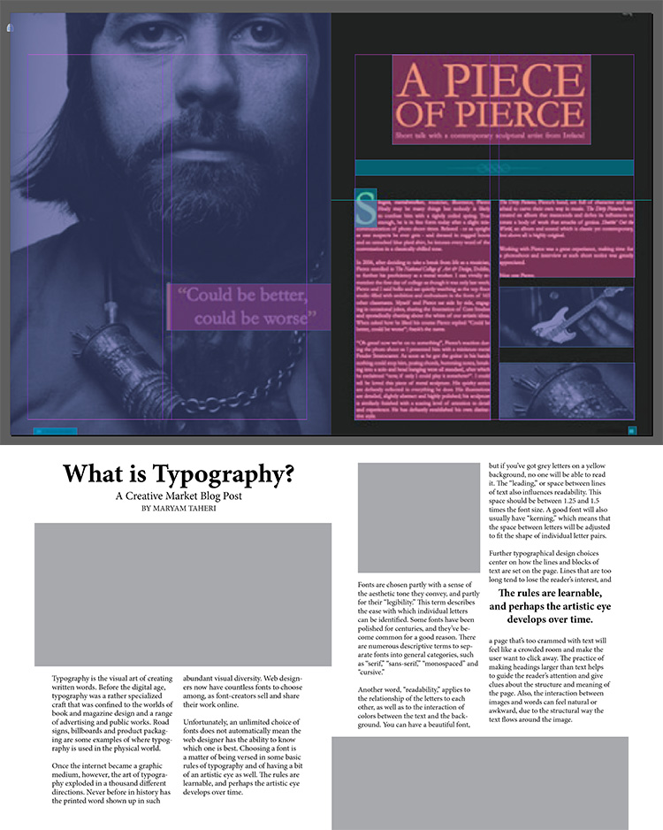
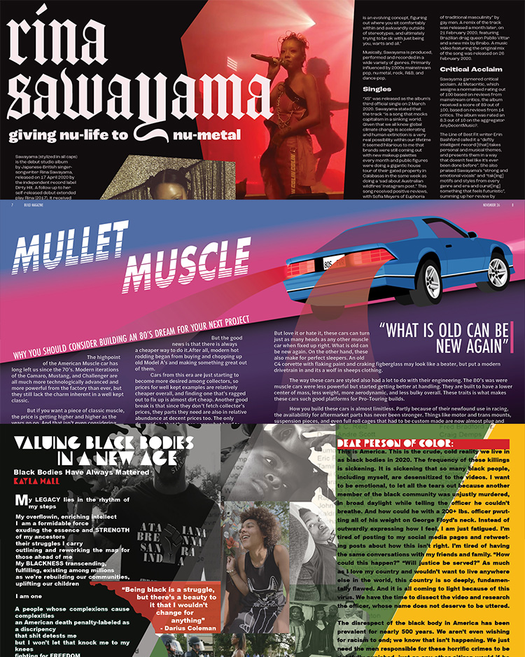
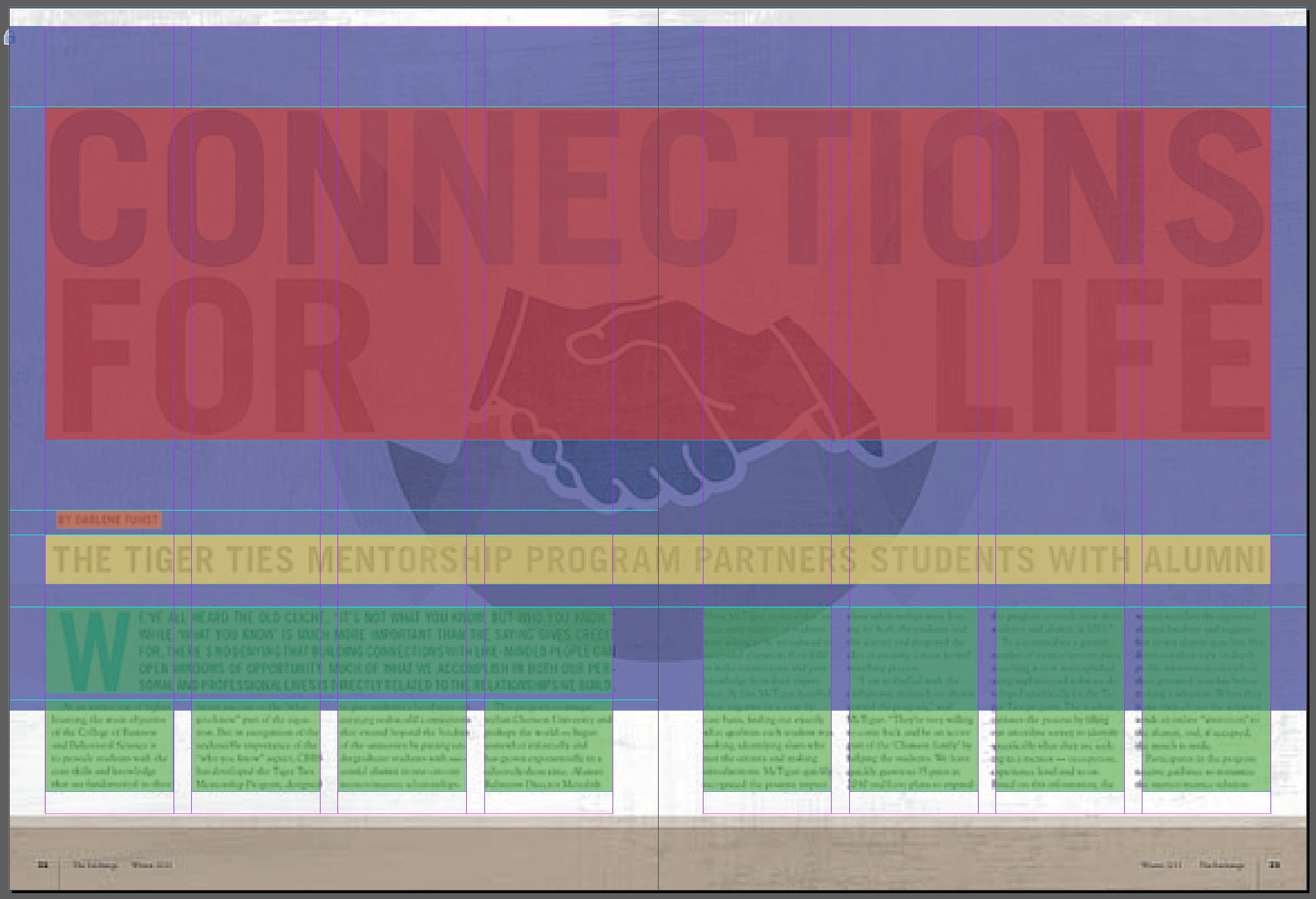
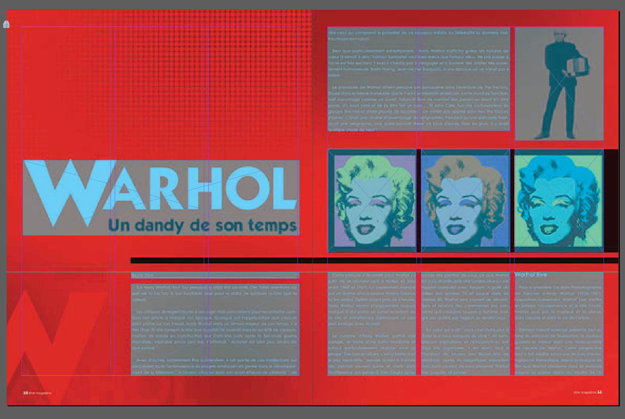
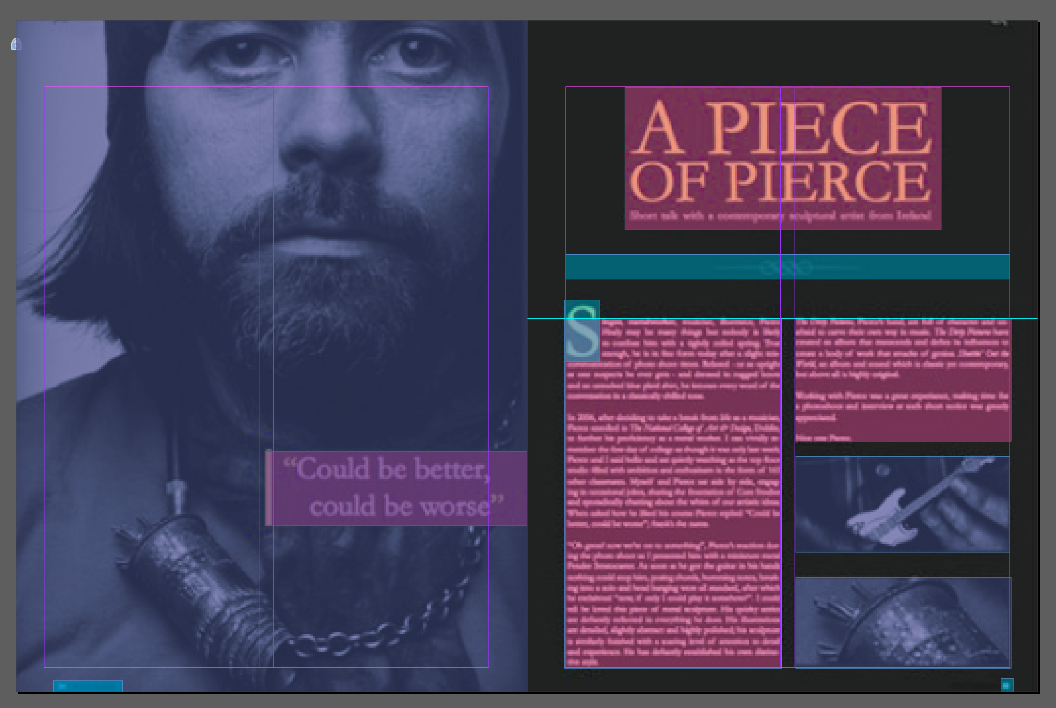
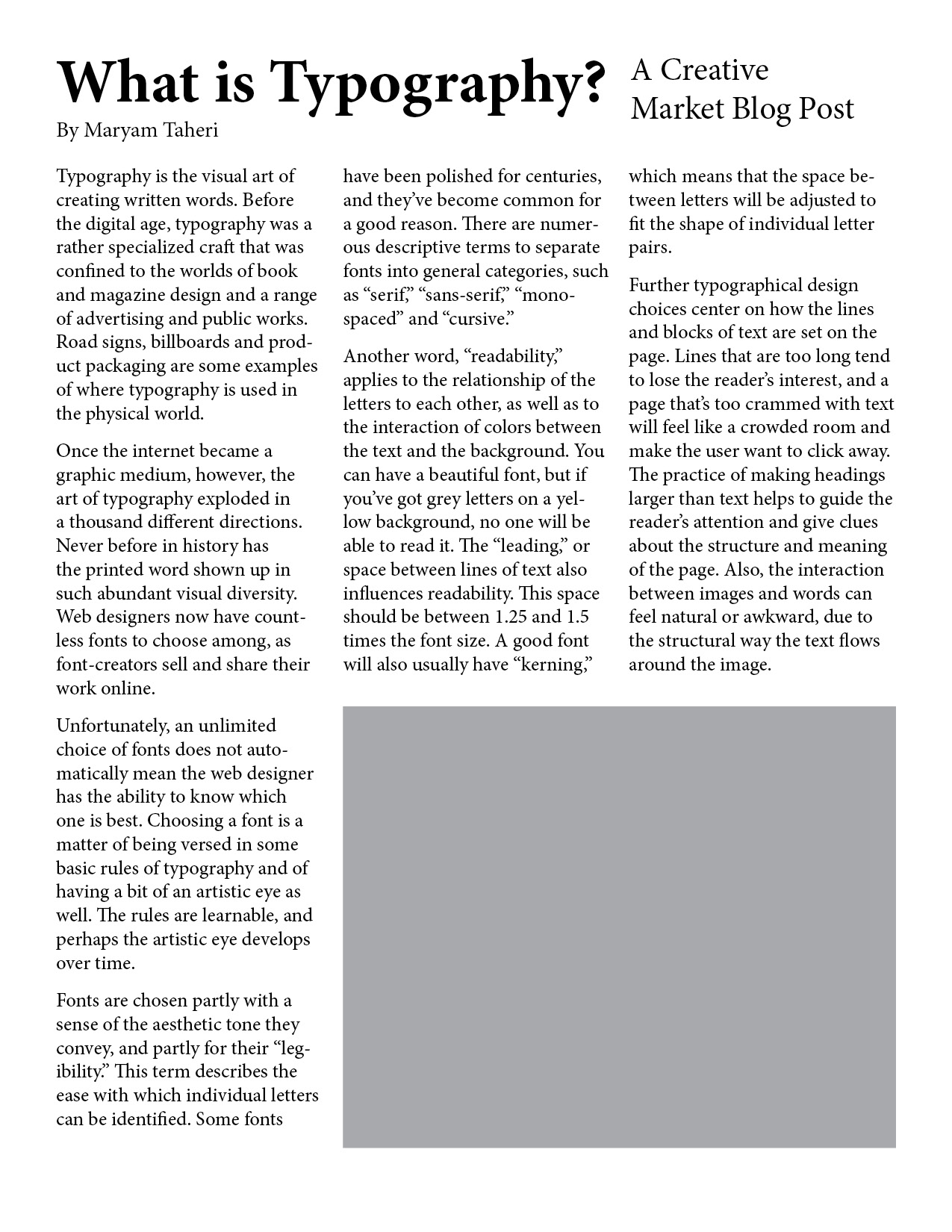
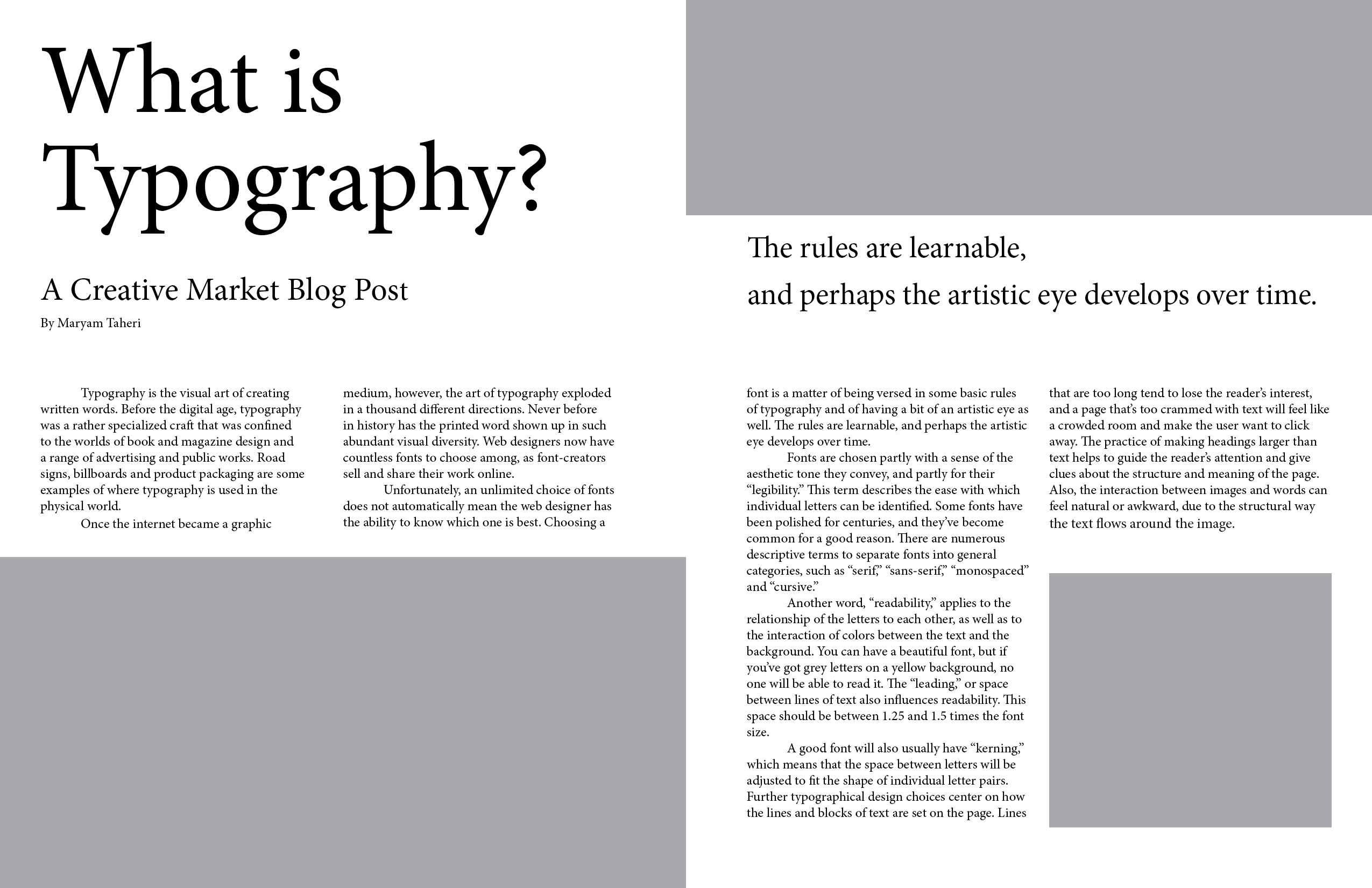
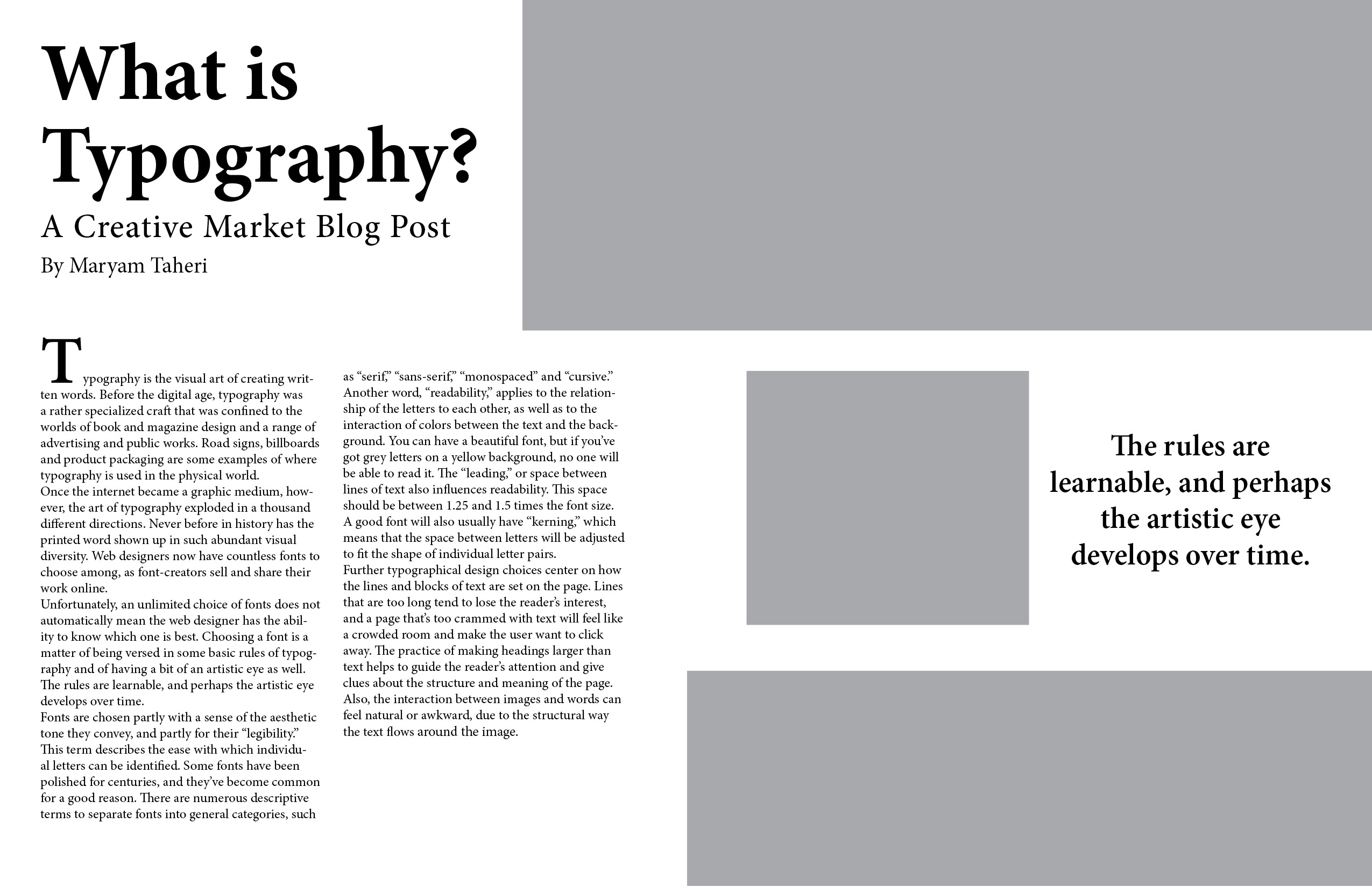
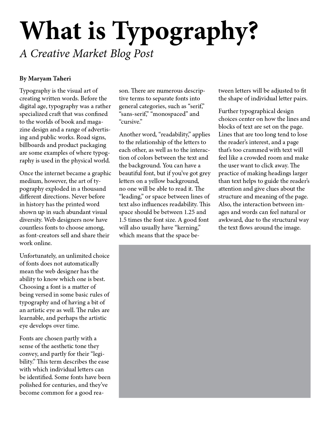
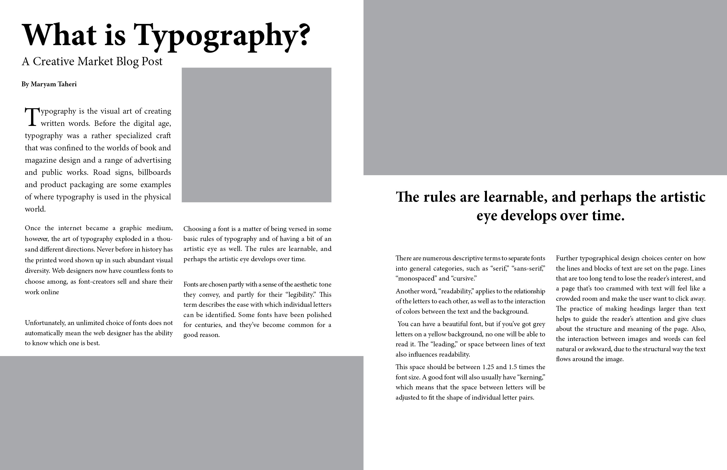
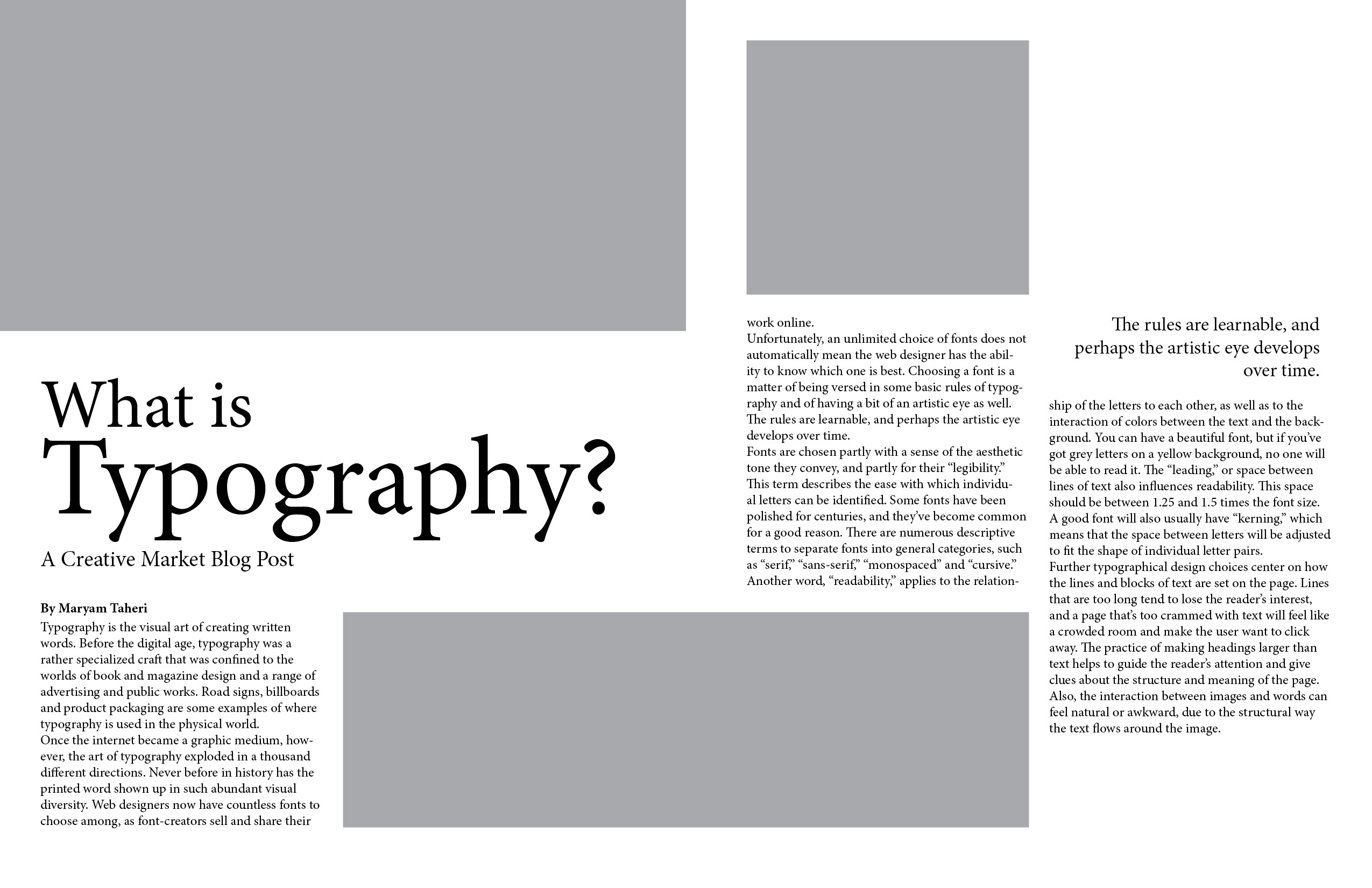
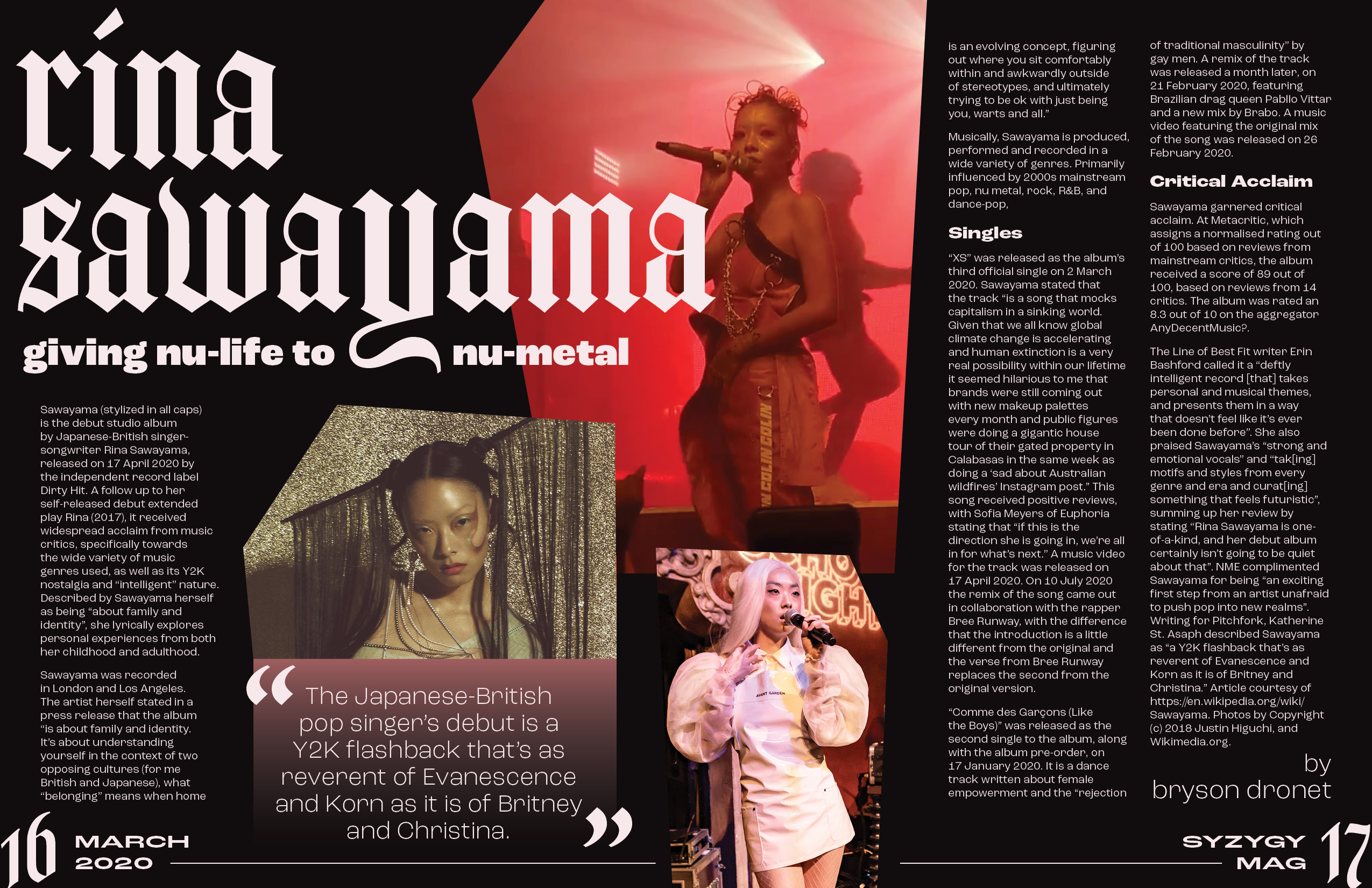
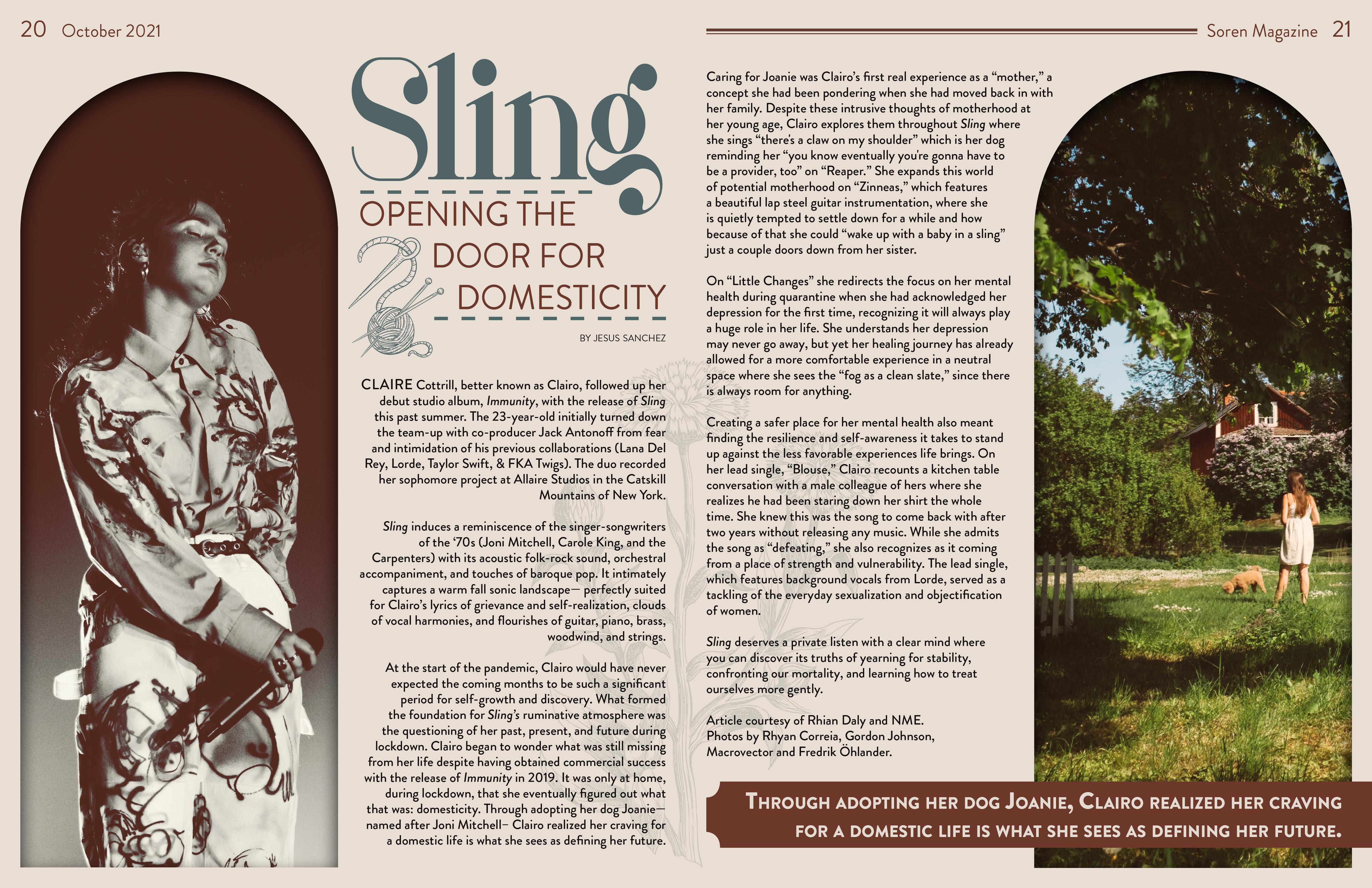
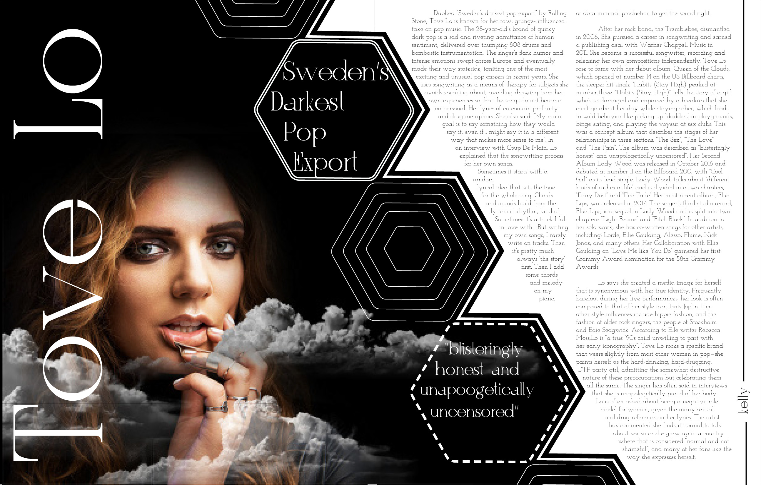
Magazine Spread Project
Students design a two-page magazine spread, combining image and text to create a visually dynamic composition aimed at a clearly defined audience. Students gain confidence working in Adobe InDesign.
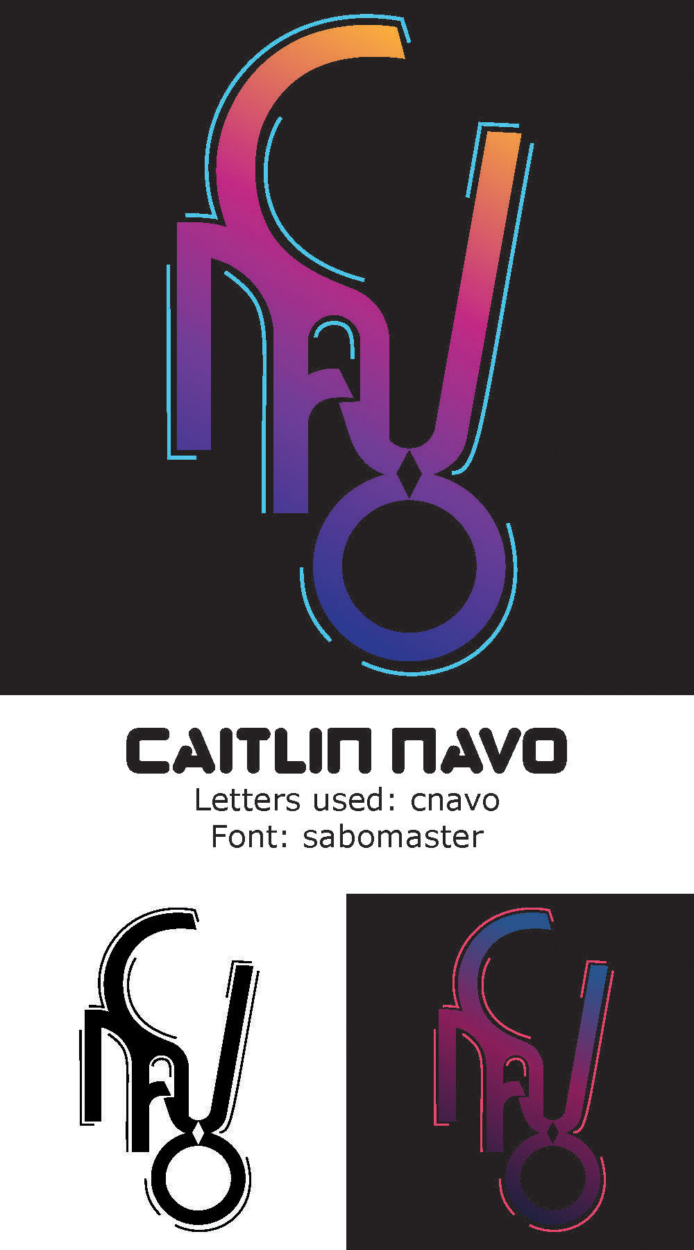
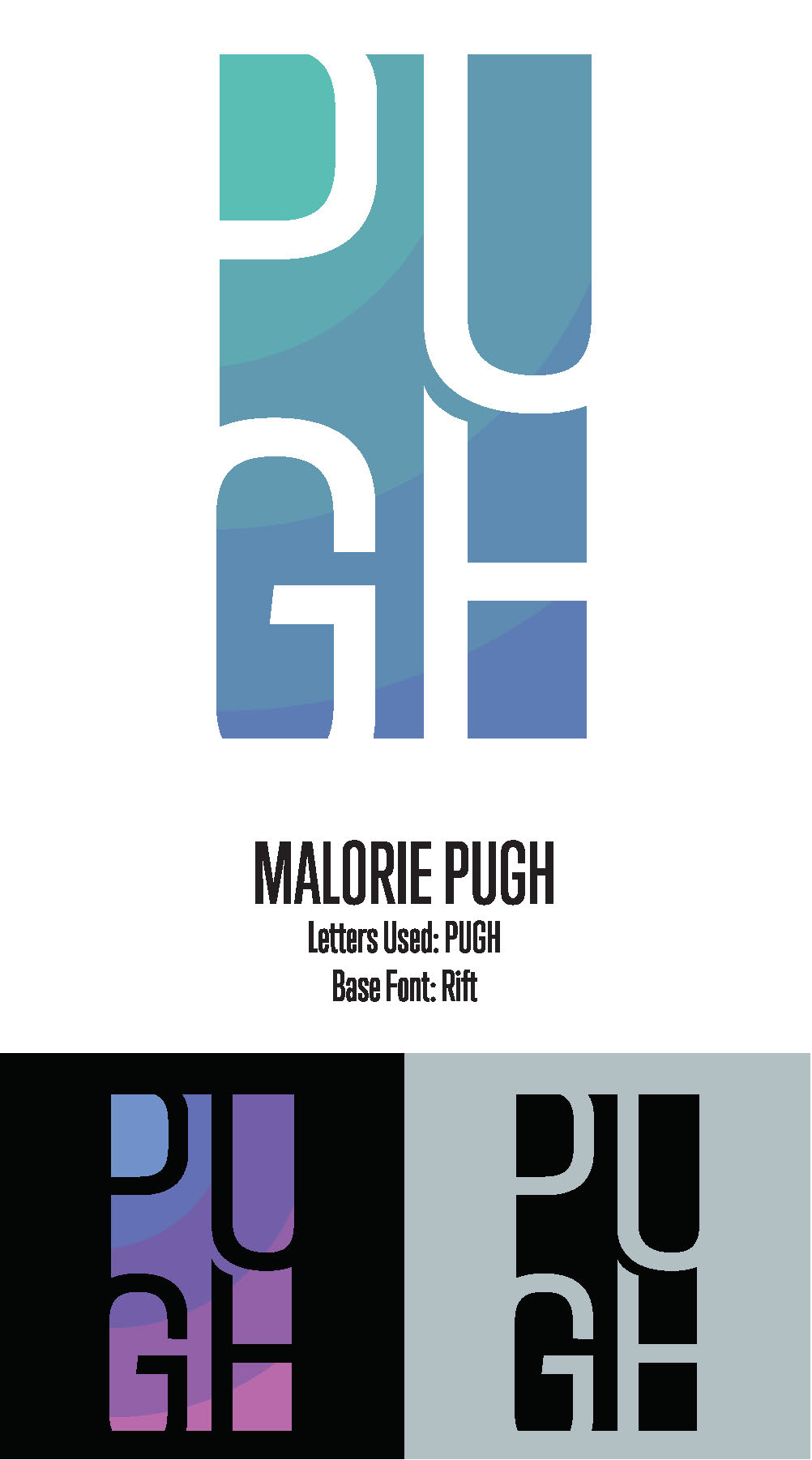
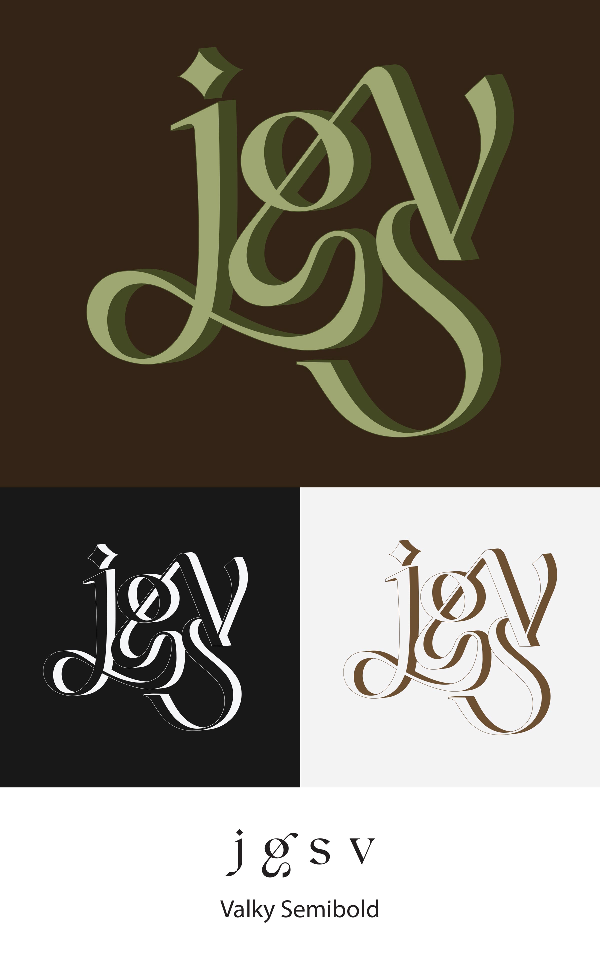
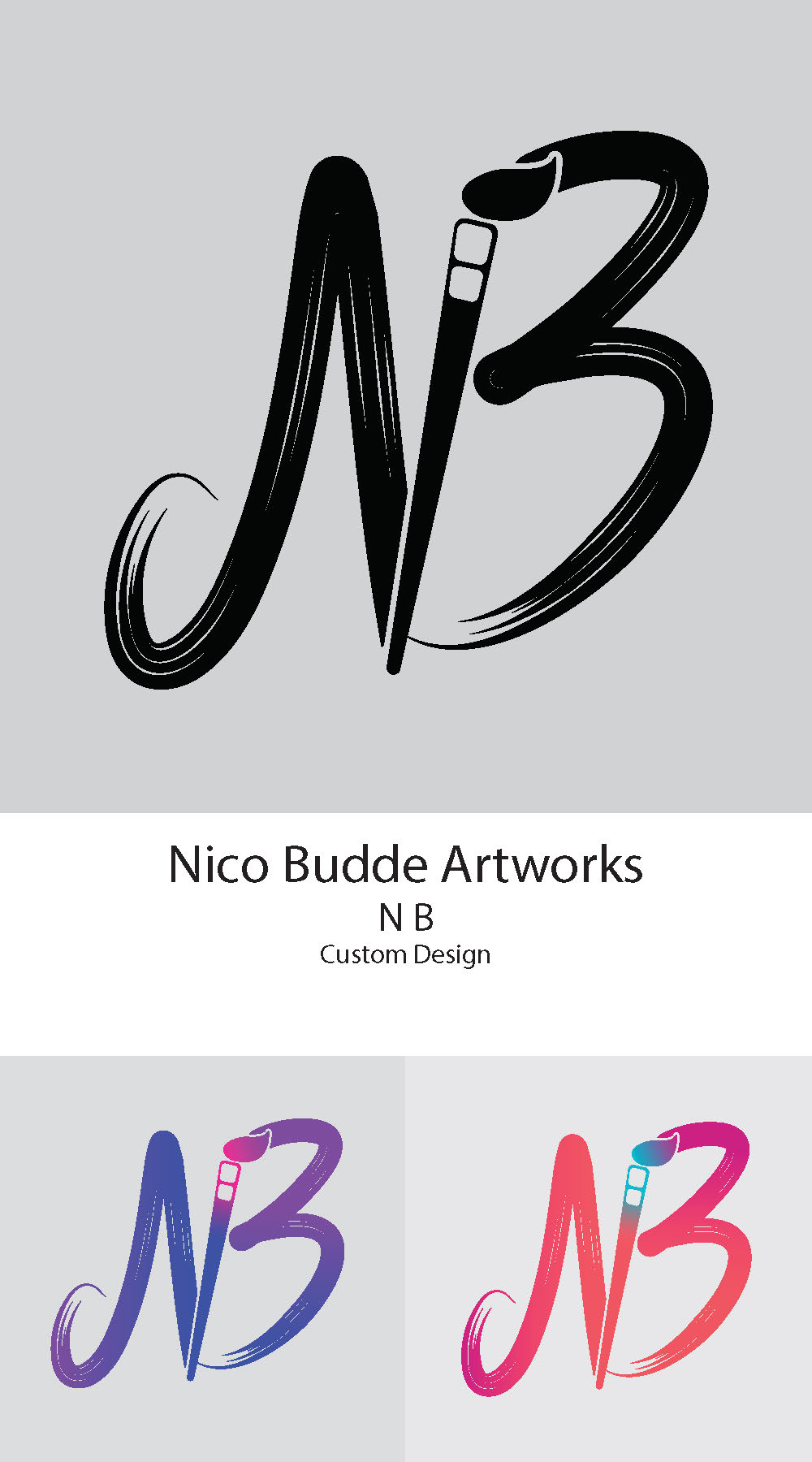
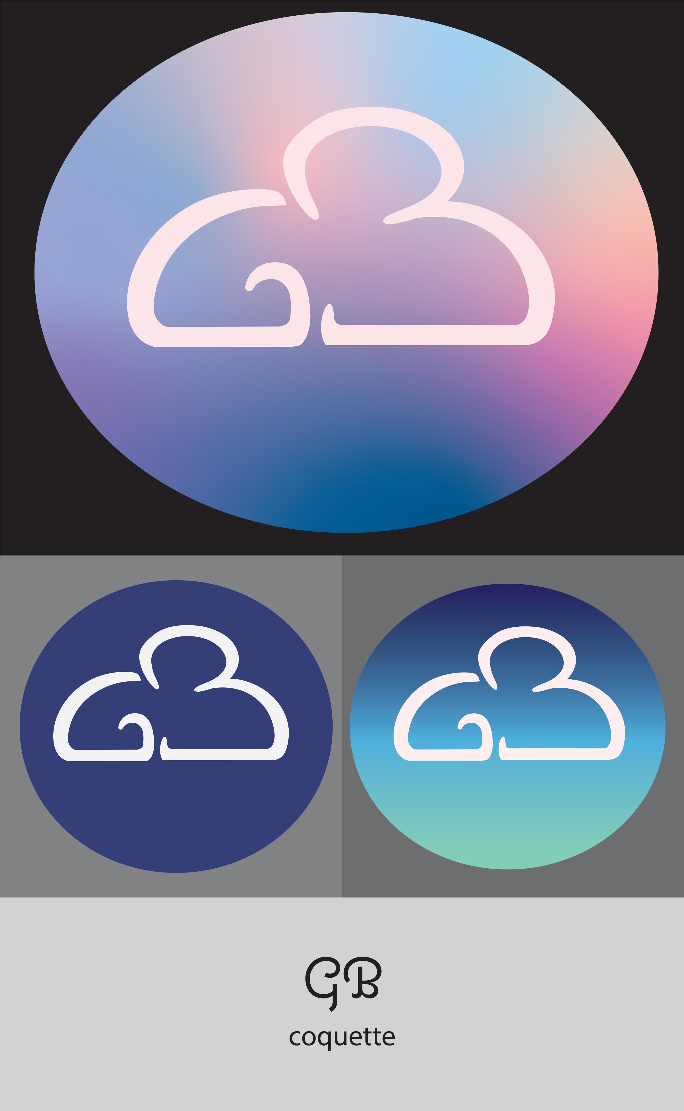
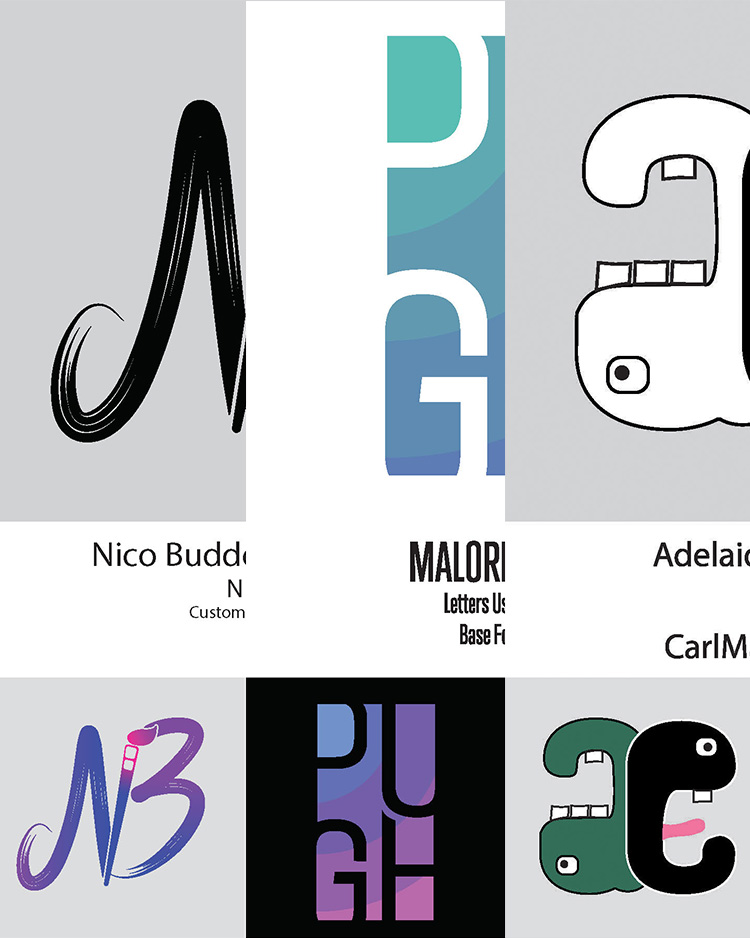
Custom Letter Mark
Students use their initials to design a letter mark. They analyze the tone they want to communicate and identify how color and font can serve that goal. A base font is chosen, and students then use Adobe Illustrator’s vector tools to customize the letters and create a juxtaposition of forms that embodies their chosen message.